Wednesday, October 31, 2018

What is a snippet?

The snippet is a single search result in a set of search results and generally consists of a title, a URL and a description of the page. The content of a snippet matches parts of the search query and you’ll see your keyword highlighted in the snippet description. Search engines often use pieces of your content to fill in the parts that make up the snippet. In most cases, search engines determine the best possible snippet for you, but you can try to override that by adding a meta description to your page. In this post, we’ll dive deeper into what is a snippet.

snippet in serps

A snippet as found on a search result page

The snippet is one of your most valuable pieces of online real estate. This is the doorway to your site, and you should make it as enticing as possible. You need people to click your link — without misleading them, of course. While search engines have the last say in how these snippets appear, you can give them options. If they deem these worthy, they’ll use it. Even Googles John Mueller says you should fill out your meta description:

Regular snippets, rich snippets, and featured snippets

The snippet in the screenshot you saw at the beginning of this article is a regular, static snippet but there are many variations to be found. Search engines love to experiment with different ways of highlighting particular results within the search results pages.

For some time now, we’ve seen rich results appear in different forms. Rich snippets are regular snippets with added information, like product details, availability, reviews and a lot more. Here’s a rich snippet for the search term [Fender Standard Precision Bass sunburst]. You’ll notice that this snippet is much ‘richer’ so to say. It has ratings, review, pricing, stock availability and some product highlights. This is a specific product rich snippets, but there are similar snippets for recipes, reviews, videos, events, courses and much more. Adding structured data is a necessity for some types of these rich results.

fender precision rich snippet

A rich snippet found while searching for [Fender Standard Precision Bass sunburst]

Another type of snippet is the featured snippet. This is a new kind of result that appears at the top of the search results pages, even before the first organic search result — at position 0 so to say. The content for these featured snippets comes from pages that best answer that specific question in its content. You can’t sign up for this — you have to earn it with your content. Here’s one of our featured snippets, this one for the search term [what is a meta description]. This feature snippet takes the full answer to that question from our article and puts it right at the top of the page.
meta description featured snippet new

A featured snippet for the search term [what is a meta description]

SEO title and meta description

Earlier, I pointed out that search engines sometimes prefer to pick their own text from a website to use in the snippets. While they are pretty apt at making up something nice, in a lot of cases you’d probably want to control how your page appears in search. One of the ways you can influence this is by adding a meta description to your page. This is a short piece of text describing your content in a way that makes it attractive for both searchers as well as search engines. You can also edit the SEO title of your article if you want to override the standard way search engines show your page title. Yoast SEO helps you do all this.

Snippet preview in Yoast SEO

Enter the snippet preview in Yoast SEO:

snippet preview new

The snippet preview gives you an idea of how your post will appear in the search results

The snippet preview in Yoast SEO gives you a good idea of how your post or page might look like in search engines. Also, you can edit the SEO title if you want it to be something else then your regular page title. If you want you can use variables, so you can automate stuff. You’ll also find the meta description field in which you can add the text you want to suggest to search engines to use. Learn how to make your site stand out in search results and how to write an awesome meta description.

Now you know all about the snippet

A snippet is a deceptively simple thing: a single search result. However, it has great power. A good snippet will help you get those clicks. You don’t just want to appear at the top of the search results, no, you want those clicks! And to get people to click, you need a brilliant snippet.

The post What is a snippet? appeared first on Yoast.

Unriddled: Messenger's New Look, Apple's Latest Products, and More Tech News You Need

"Unriddled" is HubSpot's weekly digest of the tech headlines you need to know. We give you the top tech stories in a quick, scannable way and break it all down. It's tech news: explained.

Unriddled: The Tech News You Need

1. Messenger Has a New Look

Facebook announced last week that it will soon roll out Messenger 4: the latest edition of its instant messaging platform that, among other new features, will be more personalized and easier to navigate.

messenger-4-group-chat-3-ios

Source: Facebook

Instead of its current nine tabs, Messenger 4 will only have three: chats, people, and discover. Plus, the company says, it's added new personalization features to group chats (like customizable dialogue bubble colors), while also keeping features like bill-splitting and games.

Messenger says the changes will roll out incrementally. Read full announcement >>

2. Apple's New iPad Pro and MacBook

In addition to releasing iOS 12.1 yesterday, Apple held a special event to debut the the latest editions in its line of iPad Pro and MacBook products. Among them: a new retina MacBook Air (the design of which hadn't been updated since 2010), as well as a bring-your-own-monitor-style Mac Mini.

mac-mini_top-down-isometric_10302018

Source: Apple

Also unveiled today were the two latest additions to Apple's line of iPad Pro devices, available in 11-inch and 12.9-inch models -- which are the first iPads to come with FaceID technology. Emily Bary of MarketWatch has more. Read full story >>

3. Walmart-Owned Sam's Club Will Open a Cashierless Store

In what could be interpreted as an attempt to keep up with ecommerce rival Amazon, Walmart announced that it will open a somewhat cashierless store, Sam's Club Now, in Dallas next week.

The store is largely serving as a test-run for some of the emerging, tech-driven concepts Walmart hopes to use, including augmented reality, and what Sarah Perez of TechCrunch describes as "artificial intelligence-infused shopping."

Rather than traditional cashiers, the stores will feature "Member Concierges," who could serve similar roles to those staffing Amazon Go stores to help shoppers understand the concept. Read full story >>

4. Facebook Removes 82 Pages, Groups, and Accounts in (Another) Coordinated Misinformation Campaign

Facebook said last week that it uncovered evidence of another coordinated misinformation campaign from its site, and removed over 80 pages, groups, and accounts in response.

The campaign appears to have originated in Iran, and largely involved the distribution of politically-oriented content on both Facebook and Instagram. Over one million users were following one or more of the Pages removed to take down the campaign. Tony Romm and Craig Timberg of the Washington Post share more details. Read full story >>

5. Oculus Rolls Out Options for Reporting Abuse

Oculus, the Facebook-owned maker of virtual reality (VR) hardware, announced last week that it's implementing new ways for users to report abuse -- in the form of content or other user behaviors -- from within any of its apps or games.

Oculus_Home_Landing

Source: Oculus

By allowing users to report directly from a VR experience, video is captured that provides reviewers with more detail around what, exactly, happened. Adi Robertson of The Verge has more. Red full story >>

6. Want to Know What Amazon's Cashierless Stores Are Like? We Went to One.

Haven't made it to one of Amazon's cashierless Go stores yet? We checked out the newest one. Read full story >>

7. In a Land of Automated Milk and Honey, Marketers Are Presented With an Opportunity

In what might be the tech capital of the U.S., robots are checking us out of supermarkets and making our lattes. But while this growing technology leaves many starry-eyed, it leaves others wondering about the road it paves. Read full story >>

8. 25% of People Think All Searches Will Be Done by Voice in the Next 5 Years

When it comes to voice search overtaking text in the future, many internet users seem bullish. But today, that doesn't necessarily line up with search preferences. Read full story >>

The Ultimate List of HR Interview Questions

As a job seeker, you can often expect to speak with an HR professional before moving onto interviews with employees within the department for which you're applying.

It's critical you prepare well for your HR interview. Oftentimes, a company uses their HR department to screen candidates and decide which candidates are most qualified to move forward in the interview process.

But an HR professional has different goals when interviewing than your direct hiring manager does. While your hiring manager will ask questions specific to the role, the HR professional is interested in gaining broader insights regarding culture fit and whether you demonstrate the company's values.

I spoke with Alexa Matthews, a recruiter here at HubSpot, who pointed out some additional benefits to the screening process -- "It's an opportunity for a great first impression. In the first call, a candidate can often convey things that are not written on their resume. We take that information so that we can be their advocate and make recommendations to hiring managers throughout the process."

Additionally, Alexa mentioned initial interview screens help candidates learn more about the role and evaluate their interest in the company. At the same time, these initial interviews help HR professionals set a candidate up for success, by learning what is required of the role, and providing the candidate with feedback throughout all stages of the interview process.

To help you prepare for any questions you might receiving from an HR professional, we've cultivated a list of nine, along with the best sample answers.

HR Interview Questions and Answers

1. Tell me about yourself.

One of the more traditional questions in this list, "Tell me about yourself" is nonetheless a helpful question for HR professionals to get a sense for how this conversation will go, and in which direction they should steer future questions.

Ultimately, you'll want to be prepared to describe past roles, how those roles demonstrate your strengths, and what you want in a company and role moving forward. Additionally, make sure to include why you believe this role is a good match for your talents.

You might say something like, "Well, I graduated from ABC University in 2015. Since then, I've worked my way up at Company X, from an intern blogging on the content team to an Associate SEO Strategist. Along the way, I've learned I work best in collaboration with a team, as opposed to more solitary roles. As an SEO strategist, I've discovered I enjoy the analytical side of marketing, and possess strengths that allow me to excel in those types of roles -- in fact, as a result of my SEO efforts, traffic to our site has increased 13% over the past two years. I'm now looking for new challenges and believe your company, and this role, is a fantastic next step."

2. Why are you interested in this position?

This question is a critical indicator as to whether you're interested in this company and role in particular, or whether you're simply applying to any role in the field. For instance, it's not a good sign if you say, "Well, I'm interested in social media, so this role seemed like a good fit." Instead, you want to mention specific qualifications of the role itself, and demonstrate how those qualifications align with your personal strengths. Additionally, it's important you mention how you can help drive results for the team.

For instance, you might say, "Through my last role I've learned I'm passionate about creating content for social media. I've managed to grow our Instagram audience by 7%, and with my team I created a successful Facebook campaign that cultivated an increase in sales by 12%. I've followed your business on Instagram and Facebook for a few years and appreciate your brand -- more importantly, I see this role as one in which I'd truly be challenged and able to use my strengths. In particular, I believe I'd excel in the client-facing aspect of the role. Meeting with clients to collaborate on social media marketing objectives and goals is something I believe I'd find exciting and purposeful."

3. Why are you leaving your current job?

This is an opportunity to outline positive benefits you hope to gain by transitioning into a new role. However, one of the biggest mistakes you can make when answering this question is focusing on negative aspects of your current employer, rather than discussing positive aspects of the new company.

An HR professional will mark it as a red flag if you talk poorly about your current employer or company. It illustrates someone who isn't very professional, has a negative attitude, and could bring toxic energy into their new work environment.

To avoid those traps, say something like this -- "I appreciate everything my current employer has done to help me grow, and I believe working for a small start-up over the past year has helped me develop leadership skills earlier than I could've at a larger corporation. However, I am now interested in transferring the skills I've acquired here to a larger organization, where I believe I'll find more growth opportunities in the future."

4. Can you describe a work or school instance in which you messed up?

This is an intentionally tricky question. It's meant to glean insight into whether you can learn from past mistakes. If you can't think of any past errors, it could be an indicator you aren't capable of accepting responsibility for your own mistakes. However, creating a long list of past mishaps could make you look unqualified for the role.

You'll want to answer this question succinctly, and point out an error that doesn't represent a lack of character. Consider one, well-intentioned error you've had in the past, mention it, and then talk about how you grew from that experience.

For instance, you might say, "In my prior role when I first became manager, I took on too many tasks myself and quickly became both overwhelmed, and less efficient in my role. Additionally, my team members were frustrated because they felt there was a lack of collaboration on our team. I quickly recognized I needed to learn to delegate tasks and collaborate on projects with teammates, and became a more successful manager as a result."

5. Tell me about a time when you experienced conflict with a co-worker and how you dealt with it.

The HR professional isn't interested in hearing about that time your co-worker said something snide about you in the kitchen, or when your manager overheard you gossiping about a client to a friend.

Instead, this question is asked to gain insight into how you handle professional conflict. At the office, conflict is bound to arise, particularly when you're working closely with many different people. It's critical you know how to handle conflict without pointing fingers. Your answer should primarily focus on the solution, and should show a level of empathy towards your colleagues, rather than focusing on the problem.

You might say something like, "I had a deadline I needed to meet, and I was working with a designer who promised me her designs in time. When the deadline approached, my designer wasn't ready. It made us both look poorly in front of our clients. To resolve the issue, I discussed the problem privately with my designer. She told me she was stressed out and overwhelmed, and simply needed another week on the project. I told her that was fine with me, but in the future, we needed to be transparent and honest with each other. Moving forward, we established guidelines and became more efficient teammates."

6. What do you know about our company?

This is a fantastic opportunity to impress the interviewer. Ultimately, this question aims to gauge your level of interest in the company. The more you've researched prior accomplishments, company values, and basic information regarding the product or service, the more you can demonstrate a genuine desire to work there.

For instance, you might say, "I know your company is ranked the number one web design firm in Massachusetts. Your mission statement in particular appeals to me. I also know your company emphasizes continual learning and growth, two aspects I find incredibly exciting. I've spoken to Jen and Mark, two marketers at your company, and they've described the work environment as one full of passion and innovation -- which is something I hope to find in my next role."

7. How would you improve our current product or service?

An HR professional wants to know whether you're innovative, a quick-thinker, and if you'll bring new ideas to the role. There isn't necessarily a wrong answer, here -- you just need to show some creativity, and planning in advance will help. Consider potential problems they might be experiencing with their product or service, and how your unique skill set can fill that void.

For instance, you might say, "I've noticed your product is in English, without current translation options. I believe your product could benefit from multilingual translations, which would help you appeal to a wider demographic. This could help you become more of a global leader. As someone who is fluent in French and Spanish, I'd like to potentially help spearhead a project that moves the product in that direction."

8. How would your current manager describe you?

It can be awkward to brag about yourself, so while this question may seem weird, it's really the HR professional's tactic for hearing how your current boss views you in a work environment. To feel less uncomfortable answering this question, thoughtfully consider your last performance review, and use direct quotes from your boss in your answer.

For instance, you might say, "Well, during my last performance review, my current manager told me she appreciates how quickly I take constructive feedback and use it to improve in my role. She's grateful that she never needs to repeat areas of improvement to me -- once she gives me feedback, I take it seriously and make sure she never needs to bring it up again. She has also described me as diligent and trustworthy, two aspects I believe are critical for excelling in any role."

9. What questions do you have for me?

When an HR professional asks you this question, you might be eager to end the call and say, "Nope, no questions." This would be a mistake. Having thoughtful, smart, strategic questions demonstrates your interest in the role, as well as your potential value as a future employee. They want to hire candidates who will ask questions and move the company forward, and this can't happen if you accept everything as-is.

At this stage, you should consider what your genuine concerns are regarding the role. You might ask the interviewer, "What are the company’s values? What characteristics do you look for in candidates in order to represent those values?" Or, perhaps you'll say, "What do you enjoy most about working at Company A?"

Additionally, you might ask questions regarding the role specifically, like "What do you see as the most challenging aspect of the role?" or "Are there opportunities for professional development within the role and department as a whole?"

Ultimately, an interview isn't just about allowing an HR professional to form an opinion of you -- it's also a chance for you to get a strong sense for whether you even want to work for the company. So use this last question to your advantage. 

Everything You Need to Know About Using the Waterfall Methodology

Ask any professional athlete or business executive how they became successful, and they’ll tell you they mastered a process. By figuring out which of their habits led to success -- and which didn’t -- they could improve their efficiency, effectiveness, and productivity at work.

The same logic applies to teams and project management. If your team follows a process while working on a project, you’re more likely to develop products or services that effectively solve your customers’ problems.

The waterfall methodology is one of the most widely-used software development processes in project management, and it's rooted in logic and sequence. So if you want to leverage a proven process for your project management efforts, read on.

The waterfall model has six stages: requirements, analysis, design, coding, testing, and deployment.

Waterfall Model for Software Design

Picture Credit: Software Testing Material

During the requirements stage, developers write down all the possible requirements of a system in a requirements document. The document defines what the system should do, but not necessarily how it will work. Developers will base all the software’s future development on the requirements document.

In the next stage, analysis, developers use the requirements document to examine and flesh out the logical or theoretical design of the system without accounting for its hardware or software technologies.

The project will then move onto the design stage, where developers alter the logical design of the system to make sure it works with the system’s hardware and software technologies.

Once developers finalize the system’s physical design, the project enters the coding stage. In this stage, developers will reference the system’s requirements and logical and physical specifications to write its actual code.

After coding the system, quality analysts, beta testers, and other testers will use the system and report any bugs they find. Developers will patch the most pressing issues. This is known as the testing stage.

Finally, the project enters the deployment stage, where developers release the system to their market, support their customers, maintain the system, and upgrade it to meet their customers’ evolving needs.

Advantages of The Waterfall Method

If you're considering using the waterfall method for your next project, here are the five main advantages your team will most likely experience:

  1. Developers can catch design errors during the analysis and design stages, which helps them avoid writing faulty code during the coding stage.
  2. The project has clearly defined milestones, so developers can work toward concrete goals and easily measure their progress.
  3. Developers who join the project can easily get up to speed -- all the system’s requirements are in the requirements document.
  4. The waterfall method structures and organizes the project. From design to release, developers know exactly what to work on.
  5. Developers can accurately estimate the project’s cost -- all the system’s requirements are defined during the first stage of the model.

Disadvantages of The Waterfall Method

Like every other project management process, the Waterfall Method has its disadvantages. Here are the three main ones to consider before using the method for your next project.

  1. It’s challenging for customers to define the exact functionality of a system they prefer during the early stages of development -- they must wait until developers finish building the system to see if it actually fits their needs. If the final product isn’t up to par, developers must redesign the system, which is extremely challenging and expensive.
  2. Since developers finalize the system’s requirements during the first stage of the waterfall method, they can’t change or refine the requirements during the next stages of the development cycle. This non-stop tunnel vision can sap creativity and innovation during development.
  3. Developers can’t move onto the next stage of development unless they complete the previous one, so the waterfall method can take longer than other project management processes like the agile method, which allows developers to iterate an entire system in short bursts of time, called sprints.

Tuesday, October 30, 2018

Why you should use a focus keyphrase only once

Your focus keyphrase is the keyword you want your post or page to rank for. If you’re particularly eager to rank for a specific keyword, you’ll probably be tempted to optimize many articles on your site for that keyphrase. But, that’s not what a focus keyphrase is for! You should only ever use a focus keyphrase once. But why? And what do you do if you desperately want to rank for that one particular keyphrase? Don’t despair: I’ll tell you all about it in this post.

If you want to optimize your posts for synonyms and related keyphrases, use Yoast SEO Premium! You can add multiple keyphrases, so you can optimize your articles for different terms.

Don’t compete with your own articles

The main reason why you shouldn’t use your focus keyphrase more than once is that you don’t want to compete with yourself for a position in Google. If you optimize two different articles for the same focus keyphrase, you’re telling Google that both are suitable for people searching for that keyword, and you want both of them to appear in the search results. While that’s not necessarily impossible to do, you’ll find it very hard.

You need to have a site with quite a lot of authority to rank two articles in the top ten search results for the same query. If one of your articles already ranks with that term in the search results, you may have enough authority to try and rank with a second one. If you’re not already ranking for a focus keyword, never use it twice! Update and improve your original article and write another post that covers a slight variation of the keyword.

Ranking for your desired keyphrase

What do you do if you want to rank for that particular keyphrase you’ve set your heart on? Imagine you’re starting an online store for horse feed. You probably want to rank for [horse feed], but as you’re just starting, that’ll be pretty hard. Optimizing all of your posts for [horse feed] is not the right strategy. So what should you do? Your keyword research will give you some ideas about which other terms to target.

Content for your blog

If you have a blog – which we’d advise! – you could write an awesome, long cornerstone article about all different aspects of feeding your horse well and optimize it for the term [feeding your horse] using our Yoast SEO plugin. Then mark this article as cornerstone content in our plugin.

Adding the focus keyphrase and marking as cornerstone content in Yoast SEO

This is where you’ll enter your focus keyphrase and where you can mark an article as cornerstone content in Yoast SEO

You’ll need to write a lot of posts, each covering a different aspect of your ‘head’ term. For instance, you could write articles and optimize them for focus keyphrases like [best type of hay for your horse], [pasture management], [feeding thin horses], [feeding sport horses] and so on. These focus keywords are called long tail keywords. If you link from these long tail articles to your ‘head term’ article, you’ll be telling Google which of your articles is the most important, and that’ll help with the ranking of your most valuable article. At the same time, you’ll also be attracting traffic for those long tail articles.

Content for your store

So, what if you have lots of product pages for a type of horse feed? Let’s say you have a big assortment: feeds for thin horses, feeds for fat horses, feeds for sport horses etc. Should you optimize all your product pages with feeds for thin horses for [feeds for thin horses]? In this case, it makes more sense to optimize your category page for this term instead of all those individual product pages!

Should I use a focus keyphrase more than once?

Ranking for a focus keyphrase is possible if you write an awesome cornerstone article about that particular focus keyphrase. And, don’t forget you’ll need a kickass site structure around it to make sure that article will start ranking! But, unless you’re a high authority site and already ranking well for a particular keyphrase, you should NEVER use a focus keyphrase more than once.

Read more: The ultimate guide to content SEO »

The post Why you should use a focus keyphrase only once appeared first on Yoast.

10 Tips That Can Drastically Improve Your Website's User Experience

In today's marketing landscape, your website has become a more powerful tool than ever. Your website is a 24/7 salesman, and as such, it has the potential to be your most powerful asset and the centerpiece of your marketing efforts.

Take control of your website's usability with HubSpot's Website Add-On. Try it for free here.

However, rapidly changing digital trends can make your website feel old and outdated. While sometimes a redesign might be ideal, you may not have the time or money to invest in such a large project. To help you overcome this challenge, we've put together a list of 10 simple ways you can improve your website to make it more helpful and useful.

Your website is the core anchor for your digital marketing efforts. Designing a great website user experience requires understanding the problems different visitors have to solve.

1. Use white space.

On more than one occasion I have heard clients complain that there was too much white space on their site and that this unused real estate ought to be used for advertising more of their services. However, white space is essential to good design. White space makes your content more legible while also enabling the user to focus on the elements surrounding the text.

According to Crazy Egg, white space around text and titles increases user attention by 20%. White space can also make your website feel open, fresh and modern and if your branding is consistent with these then it can help you communicate that feeling to the user. One downside of white space to keep in mind, however, is that it does indeed take up space.

If you're trying to get a lot of content above the fold (above the part that is immediately visible without scrolling) having too much white space might be replacing some valuable information. The key is to find the balance between what is most important to communicate at the top and surround that with some space to highlight the image and/or text.

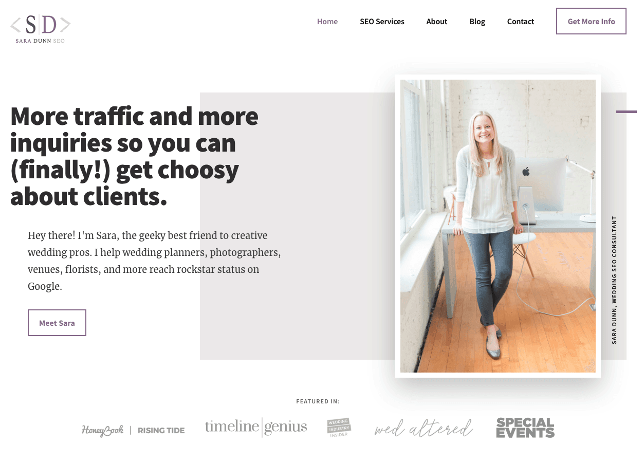
Consider the website, Sara Does SEO, by Sara Dunn. In her UX, there is a lot of white space right from the start, pulling your attention to what Sara looks like and what can do for you. This allows the reader to focus her attention on the most important things. Each section of the homepage also provides one clear header and a few supporting points, making it easier to digest information. 

Check out her website below.

Website of Sara Does SEO, using white space to improve the user experience

2. Optimize your page speed.

One of the most frustrating experiences for users of the web is waiting for a page to load for too long. With the rise of the mobile devices, people are accessing content all over the world on many different platforms. While browsing online at Starbucks or while watching TV on their laptop, they expect a fast result for the content that they want.

When they don't get it, they usually bounce. Slow page load is an interrupting experience for the user and it can be a source of frustration and often users simply don't have the time to wait.

According to Section.io, an extra five seconds of page load time can increase your website's "bounce rate" by more than 20%. Whoa.

So, where do you go from here? Get your score. Google offers a free service where you can get information on your page speed. Google will also offer you some suggestions for improving your load time on Mobile and Desktop. 

To improve your page speed, start by compressing all your images before loading them onto your website. Image file size is one of the leading causes of a slow page speed -- using websites like compressor.io can help you dramatically speed up each webpage you own.

Learn more about decreasing your website's bounce rate in this blog post.

A great example of speedy load is Barnes and Nobles. No matter what device your own Barnes and Nobles loads quickly. Taking the extra caution to load some important elements first so that you know that the content is on its way. See for yourself.

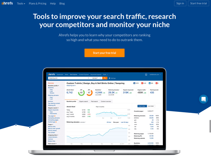
3. Use attractive calls to action.

Your customers are already accustomed to following visual cues to determine which content is important to them. Calls to actions (CTAs) that are clearly marked with an action word enable your website users to more easily navigate your site and get exactly what they want in the location they expect to find it.

In creating buttons for your website you should think about color and the psychology of color. In a study done by Maxymiser, researchers were shocked to find that hey achieved an increase of 11% in clicks to the checkout area of the Laura Ashley website, by testing color variations and action messaging. Different colors evoke different messages. Think about the message that you want to evoke for a user (trust, experience, intelligence) and choose your colors wisely.

A second thing to consider is the actual words you use for your buttons. The words should include a verb or an action word that excite the user to do something. Choosing the right words or psychological triggers is highly determined by the level of emotional identification that word prompts. No emotional connection means no action. So make your words bold, time sensitive and action-oriented.

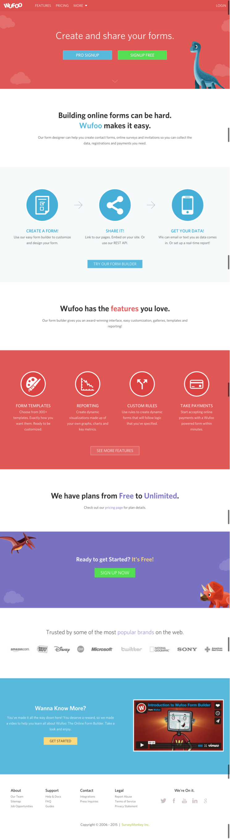
A great example of the good use of calls to action is WUFOO. The company's entire page is action-oriented and uses buttons to encourage the user to go to the next step. At the end of the page, you'll see the use of time-sensitive language like "Sign Up Now" and action-oriented language like "Get Started." These are active action words that prompt and guide the user to move forward.

Call to action on WUFOO website

4. Use hyperlink differentiation.

When you add a link to any page, you're saying you want the user to click there. Make sure links are easily identifiable by visual cues. Underlined text and differently colored text draws the attention of the reader and lets him or her know this is a link to be clicked on.

In a study done by Karyn Graves, she shows that the regular web user sees blue and underlined text as links and knows to click on them. Exploiting user expectations and what they already know about using the web is tantamount to success.

When it comes to hyperlink differentiation, you do not need to reinvent the wheel. Sticking to convention can be your best ally here. A simple way to test how effective your links are is to blur and remove the color from the design and see what stands out.

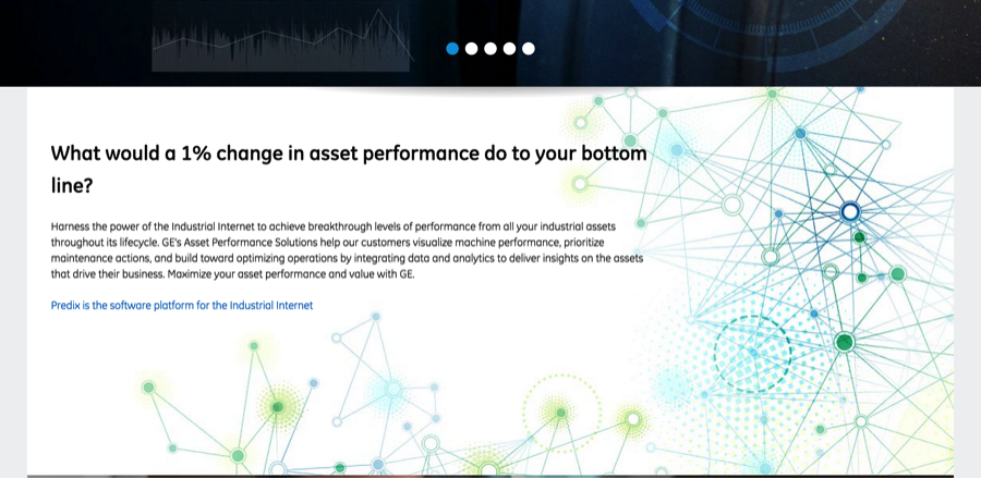
When hyperlinking, also stop to think about the length of the hyperlink. The longer the link titles the more easy to identify they are. For example: "To check out the GE Website click here." vs. "Check Out the GE Website here."

GE website using blue formatting to differentiate text from hyperlinks

5. Segment key information with bullet points.

Bullet points will enable the user to quickly get all the information they want: benefits, ways you solve their problem, and key features of a product/service -- all in a short amount of time. This will make your propositions more attractive and enable your user to get all the information they need. Additionally, you do not have to go the traditional route with a simple circle.

With tons of cool icons out there, you can also get creative with your bullet and help the reader further with images that represent your point. Why do this? Because it forces you to isolate the most important points you're trying to make without getting caught up in terminology or specifics.

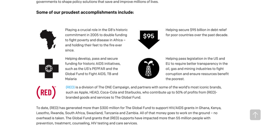
One great example of non-conventional bullets comes from One.org. On this page, they use icons as bullets to highlight their accomplishments in a way that is easy to read. Also, notice the white space surrounding the bullets that allow you to focus on each section.

One.org website, whose user experience uses bullet points to segment key information

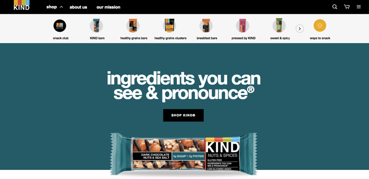
6. Use images (wisely).

People across the Internet are getting smarter and faster at judging company websites before deciding if they want to browse the site further. When they first visit your site, they can easily pick out a generic stock photo they've already seen elsewhere or that resembles the non-personal style of stock photography. Using stock photography can decrease trust and also stand out as generic and non-unique. Unfortunately, these associations carry over to your business as well.

In a case study done by Spectrum, Inc. of Harrington Movers, a New Jersey and New York City moving company, they were able to increase conversion on a page by simply replacing a stock photo with an image of the actual team of movers. They got the same increase in conversion and confidence to the page by adding a picture of their actual moving truck versus the stock photo. (Read the full study here.)

Bottom line? While stock photography can be high quality, it fails to create a connection between the user and the brand.

Ultimately, no stock photography will be as capable of conveying your brand, services, and products the way that you want to. Only your own actual images can do that while also speaking clearly to your potential customer. Use images strategically and place them in your website to support the content and allow the users a visual break from text, but make sure they are relevant and non-generic.

Check out this infographic on real images versus stock photography.

Infographic on impact of real vs. stock photography on a website's user experience

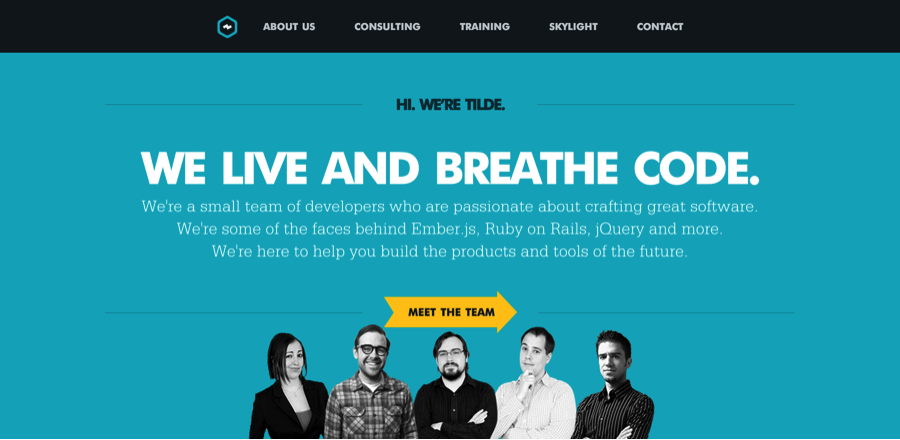
7. Include well-designed and written headings.

Your headings and content should be driven by what your potential customers are looking for. Including keywords in your title is also very important for targeting your message and attracting the right audience.

Search engines typically give headings more weight over other content, so choosing the right heading and making it stand out can significantly improve your search ability. But more importantly, headings guide your user through the site, making it easy to scan through and find content that speaks to them directly.

A great example of well-designed headings with consistent content comes from Tilde. Here you can see that the headings stand out in size and color and accurately describe the content that follows.

Tilde website with well-designed headings

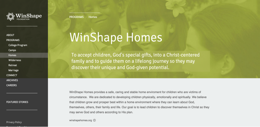
8. Keep your website pages consistent.

Consistency means making everything match. Heading sizes, font choices, coloring, button styles, spacing, design elements, illustration styles, photo choices -- you name it. Everything should be themed to make your design coherent between pages and on the same page.

In order to provide your user with a beautiful experience as they navigate through your site, it is important that they know they are still in your website. Drastic design changes from one page to the other can lead your user to feel lost and confused and to lose trust in your site.

"Am I in the right place?" Is a question I often find myself asking when navigating through inconsistent sites, and when I do, I usually end up leaving. Inconsistencies in design lower the quality of the products and services you're providing, according to the user.

Winshape Foundation is a great example of consistent design. All of its pages follow one common pattern: navigation on the right, big header, sub header with a background image and some content below. I know that no matter where I click, I'm still on their website, as all their styling is consistent. Check it out here.
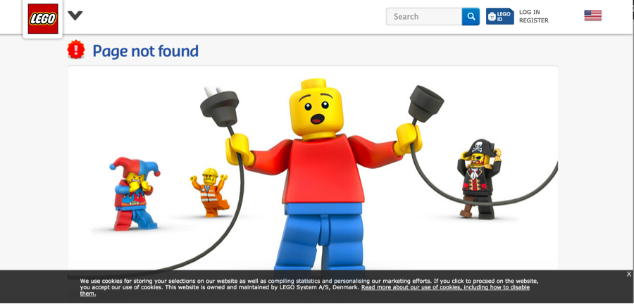
WinShape website using consistent page designs to improve the user experience

9. Catch your 404s.

While search engines don't punish you severely for soft 404 errors (page not found), a user will. When a user approaches a link or an image, they are expecting this link will take them to the next place they want to go.

Simply put, encountering a 404 error page annoys your user, and makes them rethink spending their time on your website (when they probably could go elsewhere for a faster solution). Next to slow page load time, running into 404s is another highly frustrating event for a user and it completely disrupts their journey throughout your website.

To check if you have any 404s you can set up Google Webmaster tools on your website and check crawl errors. Here's how. You can also use this free 404 checker.

As an additional resource, you can also make sure that when your user lands on a 404 it provides them with the option to get back on track. Check out these cool examples of 404 pages.

LEGO website with creative 404 error page

10. Be responsive & mobile-friendly.

Technologies have advanced to meet our needs to be mobile. Websites are also a significant part of this evolution. It's imperative that your website is mobile-friendly and easy to navigate no matter what type of device they use to access it.

Recently, Google started penalizing sites that aren't optimized for mobile devices, making the need for responsiveness even more crucial. This is probably the single-most valuable way in which you can improve your website's usability. If you're not sure whether your website is mobile, you can use this free tool.

I hope these tips have given you some ideas on how you can revamp your website to be more user friendly without shelling out the dollars on a complete redesign. To see more examples of useful websites, check out our free guide below.

examples of brilliant homepage, blog, and landing page design

22 of the Best Website Homepage Design Examples

You never get a second chance to make a first impression -- that’s why your homepage is undoubtedly one of the most important web pages on your website.

For any given company, the homepage is its virtual front door. If a new visitor doesn't like what they see, their knee-jerk reaction is to hit the "back" button.

That's right -- unfortunately, a lot of people still judge a book by its cover.

Download our full collection of homepage, blog, and landing page examples here to inspire your own website design. 

What makes a website's homepage design brilliant instead of blah? Well, it takes more than looks alone -- it also has to work well. That's why the most brilliant homepages on this list don't just score high in beauty, but also in brains.

But before we dive into the examples, let's dissect some of the best practices of homepage design.

All of the homepage designs shown here utilize a combination of the following elements.

Interactive-Form-Image.png

Not every page is perfect, but the best homepage designs get many of these right:

1. The design clearly answers "Who I am," "What I do," and/or "What can you (the visitor) do here."

If you're a well-known brand or company (i.e., Coca-Cola) you may be able to get away with not having to describe who you are and what you do; but the reality is, most businesses still need to answer these questions so that each visitor knows they are in the "right place."

Steven Krugg sums it up best in his best-selling book, Don't Make Me Think: If visitors can't identify what it is you do within seconds, they won't stick around long.

2. The design resonates with the target audience.

A homepage needs to be narrowly focused -- speaking to the right people in their language. The best homepages avoid "corporate gobbledygook," and eliminate the fluff.

3. The design communicates a compelling value proposition.

When a visitor arrives on your homepage, it needs to compel them to stick around. The homepage is the best place to nail your value proposition so that prospects choose to stay on your website and not navigate to your competitors'.

4. The design is optimized for multiple devices.

All the homepages listed here are highly usable, meaning they are easy to navigate and there aren't "flashy" objects that get in the way of browsing, such as flash banners, animations, pop-ups, or overly-complicated and unnecessary elements. Many are also mobile-optimized, which is an incredibly important must-have in today's mobile world.

5. The design includes calls-to-action (CTAs).

Every homepage listed here effectively uses primary and secondary calls-to-action to direct visitors to the next logical step. Examples include "Free Trial," "Schedule a Demo," "Buy Now," or "Learn More."

Remember, the goal of the homepage is to compel visitors to dig deeper into your website and move them further down the funnel. CTAs tell them what to do next so they don't get overwhelmed or lost. More importantly, CTAs turn your homepage into a sales or lead-generation engine, and not just brochure-wear.

6. The design is always changing.

The best homepages aren't always static. Some of them are constantly changing to reflect the needs, problems, and questions of their visitors. Some homepages also change from A/B testing or dynamic content.

7. The design is effective.

A well-designed page is important to building trust, communicating value, and navigating visitors to the next step. As such, these homepages effectively use layout, CTA placement, whitespace, colors, fonts, and other supporting elements.

Now, get ready to learn about excellent homepage design through the following 22 real-life examples.

1. FreshBooks

Freshbooks homepage web design

VIEW ENTIRE HOMEPAGE

Why It's Brilliant

  • It's easy to consume. There is much debate on whether short or long homepages work better. If you choose to do the latter, you need to make it easy to scroll and read -- and that's exactly what this site does. It almost acts like a story.
  • There's great use of contrast and positioning with the primary calls-to-action -- it's clear what the company wants you to convert on when you arrive.
  • The copy used in the calls-to-action "Get Started for Free" is very compelling.
  • FreshBooks uses customer testimonials on the homepage to tell real-world stories of why to use the product.
  • The sub-headline is also great: "Join over 10 million small business owners using FreshBooks." FreshBooks expertly employs social proof -- 10 million is a big number -- to compel its target audience to join their peers and try the tool.

2. Airbnb

Airbnb homepage web design

VIEW ENTIRE HOMEPAGE

Why It's Brilliant

  • It includes the destination and date search form that most visitors come looking for, right up front, guiding visitors to the logical next step.
  • The search form is "smart," meaning it'll auto-fill the user's last search if they're logged in.
  • The primary call-to-action ("Search") contrasts with the background and stands out; but the secondary call-to-action for hosts is visible above the fold, too.
  • It offers suggestions for excursions and getaways Airbnb users can book on the same site as their lodgings to get visitors more excited about booking their trip on the site. It also shows which of these offerings are most popular among other users.

3. Mint

Mint homepage web design

VIEW ENTIRE HOMEPAGE

Why It's Brilliant

  • It's a super simple design with a strong, no-jargon headline and sub-headline.
  • The homepage gives off a secure but easy-going vibe, which is important for a product that handles financial information.
  • It also contains simple, direct, and compelling call-to-action copy: "Sign up free." The CTA design is also brilliant -- the secured lock icon hits home the safety message once again.

4. Dropbox (Business)

Dropbox homepage web design

VIEW ENTIRE HOMEPAGE

Why It's Brilliant

  • Dropbox carries over its simple design and branding. It includes only what is important: A large, relevant image with supporting copy, and a "Try free for 30 days" call-to-action button
  • Dropbox's homepage and website is the ultimate example of simplicity. It limits its use of copy and visuals and embraces whitespace.
  • Its sub-headline is simple, yet powerful: "The secure file sharing and storage solution that employees and IT admins trust." No need to decode jargon to figure out what Dropbox really does.

5. 4 Rivers Smokehouse

4 Rivers Smokehouse homepage web design

Why It's Brilliant

  • Drool. That's what I think when I arrive at the website for 4 Rivers Smokehouse. Combined with great photography, the headline "Brisket. 18 years to master. Yours to savor." sounds like an experience worth trying.
  • The parallax scrolling guides you on a tour through the services, menu, and people having a great time -- a great use of this popular design trend.
  • The only negative? I don't live close enough to this place. Boo.

6. Cobb Pediatric Therapy Services

cobb-pediatric-therapy-homepage-design.png

VIEW ENTIRE HOMEPAGE

Why It's Brilliant

  • The headline and sub-headline appeal to the visitors' emotional side: "Work With a Company That Gets It"; "Trust us. We've been there too! We'll find jobs where you can thrive." That value proposition is unique and compelling.
  • It's hard to tell from the screenshot above, but the headline is on a rotating carousel that caters to specific personas, from job applicants to people searching for a therapist for their schools.
  • There are several pathways visitors can take when they arrive on the page, but the calls-to-action are positioned well, worded simply, and contrast with the rest of the page.

7. Melyssa Griffin

Melyssa Griffin homepage web design with yellow landing page and blue CTA button

VIEW ENTIRE HOMEPAGE

Why It's Brilliant

  • Melyssa immediately demonstrates social proof "Join over 200,000 others..."
  • She qualifies a visitor's reason for visiting her website with a quick survey, and each option links to a different content offer.
  • She adds a face to her brand. She isn't just a random website; she makes it clear she's a human whom people can connect to.
  • The page uses bright colors without being overwhelming and makes it easy to understand what Melyssa's central business offerings are.

8. Jill Konrath

jill-konrath-homepage-web-design.png

VIEW ENTIRE HOMEPAGE

Why It's Brilliant

  • It's simple and gets straight to the point. From the headline and sub-headline, it's clear exactly what Jill Konrath does (and how she can help your business).
  • It also gives easy access to Jill's thought leadership materials, which is important to establishing her credibility as a keynote speaker.
  • It's easy to subscribe to the newsletter and get in touch -- two of her primary calls-to-action.
  • The pop-up subscription CTA uses social proof to get you to join her thousands of other fans.
  • It includes news outlet logos and testimonials as social proof.

9. Evernote

Evernote homepage web design

Why It's Brilliant

  • Over the years, Evernote has turned from a simple note-saving app into a suite of business products. This isn't always easy to convey on a homepage, but Evernote does a nice job packaging many potential messages into a few key benefits.
  • This homepage uses a combination of rich, muted colors in the video and its signature bright green and white highlights to make conversion paths stand out.
  • Following a simple headline ("Remember Everything"), the eye path then leads you to its call-to-action, "Sign Up For Free."
  • Evernote also offers a one-click signup process through Google to help visitors save even more time.

10. Telerik by Progress

Telerik by Progress homepage web design

Why It's Brilliant

  • "Stuffy enterprise" isn't the feeling you get when you arrive at Telerik's website. For a company that offers many technology products, its bold colors, fun designs, and videography give off a Google-like vibe. Just one important aspect to making visitors feel welcome and letting them know they're dealing with real people.
  • I love the simple, high-level overview of its six product offers. It's very clear way of communicating what the company does and how people can learn more.
  • The copy is lightweight and easy to read. It speaks the language of its customers.

11. eWedding

eWedding homepage web design

Why It's Brilliant

  • For those love birds planning their big day, eWedding is a great destination to building a custom wedding website. The homepage isn't cluttered and only includes the necessary elements to get people to starting building their websites.
  • The sub-headline "Over 800,000 wedding websites built!" is great social proof.
  • It's included excellent product visuals, a great headline, and a call-to-action that reduces friction with the copy, "Start website."

12. Basecamp

basecamp-homepage-web-design.png

Why It's Brilliant

  • For a long time, Basecamp has had brilliant homepages, and here you can see why. It often features awesome headlines and clever cartoons.
  • The call-to-action is bold and above the fold.
  • In this example, the company chose a more blog-like homepage (or single page site approach), which provides much more information on the product.
  • The customer quote is a bold and emphatic testimonial speaking to the benefits and results of using the product.

13. charity: water

charity: water homepage web design

Why It's Brilliant

  • This isn't your typical non-profit website. Lots of visuals, creative copy, and use of interactive web design make this stand out.
  • The animated header image is a great way to capture attention.
  • It employs great uses of video and photography, particularly in capturing emotion that causes action.

14. TechValidate

tech-validate-homepage-web-design.png

Why It's Brilliant

  • This homepage is beautifully designed. I particularly love the use of whitespace, contrasting colors, and customer-centric design.
  • The headline is clear and compelling, as are the calls-to-action.
  • There's also a great information hierarchy, making it easy to scan and understand the page quickly.

15. Chipotle

chipotle-homepage-web-design.png

VIEW ENTIRE HOMEPAGE

Why It's Brilliant

  • The homepage is a great example of agility and constant change. Chipotle's current homepage is all about the forthcoming holiday, which it uses as a unique value proposition to get you to start clicking through your site. When I think Chipotle, I don't necessarily think about catering, but the site is a great reminder to consider different uses for the burritos you already know and love.
  • The food photography is detailed and beautiful, and it actually makes me hungry looking at it. Now that's an effective use of visuals.

16. Medium

Medium homepage web design

VIEW ENTIRE HOMEPAGE

Why It's Brilliant

  • This is perhaps one of the best uses of whitespace I've seen. It allows Medium's app tagline and photo to take center stage while still drawing your eye to the darker section titles on the site.
  • Medium makes it easy to sign up -- on the site, or with a simple text message to your mobile phone. I'm much more responsive to a text than an email, so this is a great strategy to keep people engaged in the signup process.
  • The homepage uses social proof to get visitors to start clicking around: The "Popular on Medium" and "Staff Picks" sections let me know where to find high-quality content.

17. Digiday

Digiday homepage web design

VIEW ENTIRE HOMEPAGE

Why It's Brilliant

  • Unlike other online news publications that inundate homepages with as many headlines and images as possible, Digiday's first section showcases just one article. Its featured image (in this case, a scary one) is eye-catching, and the headline is just asking to be clicked now that the visitor has an idea of what they're going to read.
  • The top of the homepage, where websites normally showcase a ton of different sections and options to click through, only has one icon to click -- which leads you to a subscription page.

18. KIND Snacks

KIND Snacks homepage web design

VIEW ENTIRE HOMEPAGE

Why It's Brilliant

  • The bold colors produce contrast, making the words and images stand out on the page.
  • The CTA -- "Shop KIND" -- is clever. It urges the visitor to click to learn more while making a play on the word "kind" -- implying that it's a good choice to shop there.
  • KIND Snacks' tagline is straight up brilliant -- when I read it, the message immediately resonated and made me want to read the snack bar's label.

19. Ahrefs

Ahrefs-homepage-design.png

VIEW ENTIRE HOMEPAGE

Why It's Brilliant

  • The color contrast between the blue, white, and orange colors is eye-catching and makes the headline and CTA pop.
  • The sub-headline and CTA are a compelling pair: To be able to start tracking and outranking competitors for free is a great offer.
  • The homepage presents a multitude of options for the visitor, but it isn't cluttered thanks to the solid background and simple typography.

20. A24 Films

A24 Films homepage web design

VIEW ENTIRE HOMEPAGE

Why It's Brilliant

  • The film company's homepage is made up of only trailers for its new films. We know video content is format audiences want to see more of, and this is a great strategy to showcase A24's work in a highly engaging way.
  • At the top of the homepage, A24 immediately offers a myriad of ways to get in touch via social media and email -- something I appreciate as a visitor when so many other sites bury contact information at the bottom of the page.

21. Ellevest

Ellevest homepage web design

VIEW ENTIRE HOMEPAGE

Why It's Brilliant

  • "Invest Like a Woman: Because money is power." These headlines are powerful and make me want to learn more about the product -- both as a woman, and as someone interested in making smart financial choices.
  • The images show, rather than tell, one of the company's value propositions: a desktop site and mobile app that move with you.
  • "Get Started" is a great CTA -- in fact, we use it ourselves here at HubSpot. When clicked, it takes visitors through a few simple steps to set up a profile and start investing.

22. HubSpot

HubSpot homepage web design

VIEW ENTIRE HOMEPAGE

Why It's Brilliant (If We Do Say So Ourselves)

  • The LEGO characters catch your attention (because they're cute), then they cleverly illustrate and reinforce the messaging in the headline and sub-headline.
  • It bears another eye-catching "Get Started" CTA -- with bonus microcopy detailing our free versions users can choose to upgrade in the future.
  • Throughout the homepage, our bright blue and orange color themes keep returning to draw your eye to links and CTAs.

Looking for more inspiration? Check out these incredible About Us pages.

examples of brilliant homepage, blog, and landing page design

Examples of Website Design