Friday, June 29, 2018

How to Find Out Why You Didn’t Get the Job

You send in a stellar resume. You blow the recruiter away in the phone screen. And you wow everyone you speak with during your in-person interview. And yet, you still don’t get the job. Worst of all, you don’t know why you didn’t get it -- you either didn’t hear back at all, or received feedback so vague that it’s virtually useless (e.g. “We decided to go with another candidate who was a better fit.”) Is there anything worse?

It’s incredibly frustrating when a recruiter or hiring manager doesn’t share a concrete reason why you were passed over, but if it happens to you, don’t worry. Often, there’s still a way to figure out what went wrong -- here’s how.

1. Reach Out to the Decision Maker

If you have the contact info of the hiring manager, it’s best to chat with them rather than a recruiter or HR representative, says Ren Burgett, career coach and owner of 3R Coach.

“An HR manager or recruiter is more likely to give you a programmed HR response such as, ‘We found a candidate that was a better fit for our needs.’ The hiring manager is more likely to give you a candid response,” she explains.

If you haven’t already been in touch with the hiring manager, though, you may want to reach out to someone who can point them in your direction.

“If you don’t have their contact details, you need to get in touch with whoever your point of contact was throughout the recruitment process. Even if they can’t provide feedback themselves, they will be able to pass your query onto someone who can,” says Steve Pritchard, HR Manager at Cuuver.com.

When you haven’t been given the hiring manager’s contact information, it can be tempting to bypass your point of contact and look them up on LinkedIn or Google their email address, but this is a mistake, Pritchard says: “They may not feel too comfortable with you contacting them using a number/email they didn’t provide you with.”

2. Express Gratitude

Nobody wants to engage with a candidate who sounds demanding or presumptuous, so make sure to open your message with a note of thanks.

“Thanking someone for [taking the] time to interview you and provide the opportunity can always start the conversation in a positive manner,” says Shanalee Sharboneau, President and Technical Recruiter at Staffing Science, LLC.

In particular, you should express gratitude for the fact that they are going out of their way to read your note. After all, they don’t have to share feedback with you.

“Show in your request for feedback that you appreciate the recruiter or hiring manager is likely to be busy. This way, you don’t sound too pushy or demanding,” Pritchard adds.

3. Be Positive

You may be upset that you didn’t get the job, but remember: you catch more flies with honey than with vinegar. It’s okay to acknowledge that you’re disappointed with the outcome, but don’t express resentment or aggression.

Show “that you are understanding of their decision not to hire you, otherwise, you may sound bitter about not getting the job rather than someone looking for honest feedback to help them with their job search,” Pritchard continues.

And instead of taking a self-deprecating approach like “How did I screw up” or “Where did I go wrong”, frame the conversation as a quest for personal growth.

“Don’t make your question about ‘why’ you didn’t get the job, make your question about ‘how’ you can improve. People are more likely to respond to someone that seeks out growth as opposed to someone that just wants answers,” Burgett says.

4. Keep it Short and Specific

When reaching out for feedback, “make your email no more than one paragraph,” Burgett recommends. After all, they are probably plenty busy with their day-to-day tasks, so you want to make sure to honor their time.

You can save them even more time by avoiding general questions like “Why didn’t I get the job?” and instead drilling down into a few precise issues. Burgett recommends including “two to three specific questions [that] you would like feedback on from the interview process.”

One question that Laura Handrick, Career Analyst at FitSmallBusiness.com, recommends asking is “what might you have done, said or provided differently that would have made the company choose YOU instead of the other candidate.”

5. Open the Door for Future Opportunities

Just because you were rejected from a job doesn’t always mean that you can never apply there again -- you may have been a close second. At the end of your message, reiterate your interest in the company (if you are truly interested) and consider adding something like “if anything changes, I’d love to connect regarding future opportunities.”

“That will go far, and many times, new hires fail in the first few months. They’ll remember your graciousness,” Handrick says.

You can also see if they might be willing to refer you to another opportunity.

“Always end the email by asking if they know of anyone else you can reach out to as you continue your job search. If you didn’t get the job, perhaps you can get a lead [for] another job. Use this as an opportunity to network,” Burgett says.

6. Be Patient and Ready to Take No for an Answer

If the person you reach out to fails to respond, don’t ping them every day until they do.

“Giving feedback, particularly constructive feedback, is hard, so allowing time for preparing will likely get you more thoughtful responses,” points out Dr. Dawn Graham, Career Management Director at the Wharton School and host of Career Talk.

Even if they never respond, you shouldn’t pester them, Graham adds.

“Companies tend to avoid giving candidates feedback to avoid opening themselves up to risk,” she explains. “In addition, many hirers have trouble putting their fingers on a clear definition of ‘fit’ or likability, which are two powerful aspects of hiring decisions that can be challenging to put into words. Therefore, they may pass on giving feedback to a rejected job seeker for the sheer reason that even they are unable to verbalize their final decision in a way that will be meaningful to the overlooked applicant.”

Sample Message

Want an example of what exactly you could say to a hiring manager? Burgett recommends the following:

Hi (Hiring Manager),

I wanted to thank you for the amazing opportunity to interview for the position of (job title) with your company. I really enjoyed learning about (company name) and getting to know you and your team during the interview process. I understand you have decided to move forward with another candidate that better fits your current needs.

As I continue my job search, I would love to get your feedback on how I can improve as a candidate. When you have a minute, could you provide insight into what I can improve upon to help me stand out and progress in my career? Specifically, I would appreciate feedback on the following:

1. What is the one skill I can improve upon to help advance my career that may be holding me back?

2. If I had the opportunity to redo my interview, what is the one thing I should have done differently?

I appreciate any candid feedback you can offer as it will help me understand the areas I need to improve. Additionally, if you know of any companies that may be hiring for similar positions or anyone else I should reach out to as I continue my job search, please let me know.

Again, thank you for the opportunity to interview for the position. I wish you and your team continued success.

Sincerely,

Your Name

There’s no doubt that getting rejected from a job you were interested in is upsetting, and it can be doubly so if you don’t hear actionable feedback from the hiring team. But odds are, it’s nothing personal, so try not to take it that way. And remember -- the right job is out there. It’s only a matter of time until you find it.

This article originally appeared on Glassdoor and was re-published with permission.

Ask Yoast: Creating landing pages for affiliate marketing

Here's What Playing With a VR Headset Is Actually Like

Virtual reality (VR) is one of those technologies, it seems, that will be eternally "emerging."

Don't get me wrong -- it's certainly becoming more of a household topic. Twenty years ago, one might only come across VR in museums, science fairs, and laboratories. Now, they're available for purchase by anyone who has an internet connection ... and the budget to pay for one.

Several major tech players are trying to make VR a mainstream technology. Maybe the hardware needs to be less clunky and a wireless, lightweight headset is the answer.

Or maybe the obstacle is price point -- to which Facebook's answer (to both issues) was the wireless, $199 "affordable" Oculus Go.

Truthfully, I've always been a bit skeptical of VR. I remember being quite fascinated with it at a west coast science museum at the age of 13, and since then, my only real exposure to it has been by way of any VR-related news I've covered, or different demos I've tried at industry events. Even after receiving a complimentary Oculus Go as a token of thank-you swag for attending F8 in May, the headset sat on my desk, neglected an unopened for over a month.

I'm in the small percentage of people who talk about technology on a near-daily basis -- and yet, I was less than enamored with the idea of giving my very own Oculus Go for a spin.

But then -- I did. And everything changed.

Because I'm a nerd, I've always wondered what prevents VR from becoming a mainstream technology as quickly as some of the businesses behind it wish it would. People have paid more for less practical tech tools -- things like the first edition of any new iPhone, for instance, for which masses are willing to pay the initial price.

So, at the end of the day, maybe VR isn't as practical -- but it is plain cool. You can watch documentaries in an immersive, 360-degree way. You can play sports. You can visit other countries.

Maybe -- just maybe -- what's standing in the way of VR's market permeation is the small percentage of people who actually get to experience it.

To test this hypothesis, I passed around my Oculus Go to several members of my team. After spending a day engaging in various VR experiences -- and accomplishing little else -- here's what we learned.

(P.S. Here's a sneak preview of a short film I like to call, "Amanda Tries a VR Roller Coaster.")

Here's What Playing With a VR Headset Is Actually Like

On VR's Market Permeability

Before we took the headset for a spin, I asked Paul Mealy, author of Virtual & Augmented Reality For Dummies, for his thoughts on VR's potential -- if any -- to go mainstream. But that's not easy, he said, considering that "mainstream" is often a subjective concept.

If "mainstream" means "millions of devices purchased," Mealy explains, "then VR is already mainstream" -- though that figure still falls short of Facebook (which owns Oculus) CEO Mark Zuckerberg's ultimate goal of one billion people using VR ... eventually.

But what will the composition of those one billion users look like? Will they be using VR for fun, business, or both?

"If the definition of mainstream is, 'Will I find myself going to the office and donning a VR headset for all my work, and going home and putting on my VR headset for all my entertainment,'" says Mealy, "then we still have a ways to go."

Arguably, the "fun" use cases for VR are growing more rapidly than the B2B ones -- though the latter is slowly making progress. Take the example of Tobii Pro, a tech company that pairs VR with eye-tracking technology to help retailers learn where a shopper pays the most visual attention and plan store layout accordingly. I took it for a spin at SXSW in March:

"Very similar to an in-store shop-along or in-depth interview research, this is another tool that can be added on top of that," said Amanda Bentley, Tobii Pro's Director Of Commercial Sales (whose voice can be heard in the background of the video above). "You can get another layer of understanding not only how shoppers feel ... but also, what information do they actually process? What are they attending to as they're making the decision to purchase products?"

But, it's early, Mealy says -- and it's not a question of "if" VR will go mainstream, but "when."

"It is important that we take a step back and look at the full picture for VR. Most VR hardware is still in the first generation of devices," he explains. "And these first generation devices are serving as the canary in the coal mine to manufacturers, helping them refine what consumers actually want in order to become a mass-consumable device."

So, when will VR finally win over the masses?

"Three to five years out seems like an appropriate time to truly evaluate where VR is landing in the grand scheme of things," Mealy says. "If, by then, manufacturers have still been unable to solve the price and experience points ... that is the time to question VR's future. But, as of now, consider me bullish on the future of VR."

Our Team's Experience

Now, for the fun part: our team taking VR for a spin.

For most of us, this experiment was the first instance of using VR -- which made for low expectations as to how realistic, engaging, or nauseating the experience would be. (In full disclosure, I experience motion sickness with VR, and apparently, I'm not alone.)

But for the most part, the technology was well-received ... and, perhaps, even more fun to watch than to actually experience.

Caroline Forsey, Staff Writer, HubSpot Marketing Blog

The experience:

Bear Island

The video:

The summary:

"VR is different than watching something on a screen, because it’s all around you ... and behind you, and in your peripheral vision. Despite how 'logically' smart I am at understanding what VR is, I still think it can trick my brain into somewhat believing I’ in a different place. For instance, when the bear came towards me I couldn’t help but flinch. It’s bizarre but impressive that a piece of technology can influence your physiological reactions."

Clifford Chi, Junior Staff Writer, HubSpot Marketing Blog

The experience:

Cloudlands: VR Minigolf

The video:

The summary:

"VR mini golf was better than real mini golf. That was my first VR experience, and I felt like I was in a different world. After my first putt, I tried to walk toward the ball. I ended up running into a pillar in the office. And when I looked down at my feet and saw that the golf course was on a cliff, I thought I was going to fall for a split second. The Oculus and VR are super realistic and impressive. I definitely want to try it again."

Braden Becker, Senior Staff Writer, HubSpot Marketing Blog

The experience:

Epic Roller Coasters

The video:

The summary:

"I was really surprised how easily VR takes over your peripheral vision. The experience literally surrounds you, to the point where I actually felt like I was on a roller coaster. I'm also not the biggest fan of heights, and that particular Oculus Go game definitely played right into my senses."

Karla Cook, Section Editor, HubSpot Marketing Blog

The experience:

Cloudlands: VR Minigolf

The video:


The summary:

"The environment was clearly not realistic, but it still felt like I was there. The whole experience was surprisingly disorienting. I was playing mini-golf on a platform floating in the clouds, and I dangled my leg off the platform, and freaked out. The process of using the remote to interact with the environment didn’t feel intuitive to me. It’s worth trying out for the novelty factor, but I definitely wouldn’t buy it."

What Do SEOs Do When Google Removes Organic Search Traffic? - Whiteboard Friday

Posted by randfish

We rely pretty heavily on Google, but some of their decisions of late have made doing SEO more difficult than it used to be. Which organic opportunities have been taken away, and what are some potential solutions? Rand covers a rather unsettling trend for SEO in this week's Whiteboard Friday.

What Do SEOs Do When Google Removes Organic Search?

Click on the whiteboard image above to open a high-resolution version in a new tab!

Video Transcription

Howdy, Moz fans, and welcome to another edition of Whiteboard Friday. This week we're talking about something kind of unnerving. What do we, as SEOs, do as Google is removing organic search traffic?

So for the last 19 years or 20 years that Google has been around, every month Google has had, at least seasonally adjusted, not just more searches, but they've sent more organic traffic than they did that month last year. So this has been on a steady incline. There's always been more opportunity in Google search until recently, and that is because of a bunch of moves, not that Google is losing market share, not that they're receiving fewer searches, but that they are doing things that makes SEO a lot harder.

Some scary news

Things like...

  • Aggressive "answer" boxes. So you search for a question, and Google provides not just necessarily a featured snippet, which can earn you a click-through, but a box that truly answers the searcher's question, that comes directly from Google themselves, or a set of card-style results that provides a list of all the things that the person might be looking for.
  • Google is moving into more and more aggressively commercial spaces, like jobs, flights, products, all of these kinds of searches where previously there was opportunity and now there's a lot less. If you're Expedia or you're Travelocity or you're Hotels.com or you're Cheapflights and you see what's going on with flight and hotel searches in particular, Google is essentially saying, "No, no, no. Don't worry about clicking anything else. We've got the answers for you right here."
  • We also saw for the first time a seasonally adjusted drop, a drop in total organic clicks sent. That was between August and November of 2017. It was thanks to the Jumpshot dataset. It happened at least here in the United States. We don't know if it's happened in other countries as well. But that's certainly concerning because that is not something we've observed in the past. There were fewer clicks sent than there were previously. That makes us pretty concerned. It didn't go down very much. It went down a couple of percentage points. There's still a lot more clicks being sent in 2018 than there were in 2013. So it's not like we've dipped below something, but concerning.
  • New zero-result SERPs. We absolutely saw those for the first time. Google rolled them back after rolling them out. But, for example, if you search for the time in London or a Lagavulin 16, Google was showing no results at all, just a little box with the time and then potentially some AdWords ads. So zero organic results, nothing for an SEO to even optimize for in there.
  • Local SERPs that remove almost all need for a website. Then local SERPs, which have been getting more and more aggressively tuned so that you never need to click the website, and, in fact, Google has made it harder and harder to find the website in both mobile and desktop versions of local searches. So if you search for Thai restaurant and you try and find the website of the Thai restaurant you're interested in, as opposed to just information about them in Google's local pack, that's frustratingly difficult. They are making those more and more aggressive and putting them more forward in the results.

Potential solutions for marketers

So, as a result, I think search marketers really need to start thinking about: What do we do as Google is taking away this opportunity? How can we continue to compete and provide value for our clients and our companies? I think there are three big sort of paths — I won't get into the details of the paths — but three big paths that we can pursue.

1. Invest in demand generation for your brand + branded product names to leapfrog declines in unbranded search.

The first one is pretty powerful and pretty awesome, which is investing in demand generation, rather than just demand serving, but demand generation for brand and branded product names. Why does this work? Well, because let's say, for example, I'm searching for SEO tools. What do I get? I get back a list of results from Google with a bunch of mostly articles saying these are the top SEO tools. In fact, Google has now made a little one box, card-style list result up at the top, the carousel that shows different brands of SEO tools. I don't think Moz is actually listed in there because I think they're pulling from the second or the third lists instead of the first one. Whatever the case, frustrating, hard to optimize for. Google could take away demand from it or click-through rate opportunity from it.

But if someone performs a search for Moz, well, guess what? I mean we can nail that sucker. We can definitely rank for that. Google is not going to take away our ability to rank for our own brand name. In fact, Google knows that, in the navigational search sense, they need to provide the website that the person is looking for front and center. So if we can create more demand for Moz than there is for SEO tools, which I think there's something like 5 or 10 times more demand already for Moz than there is tools, according to Google Trends, that's a great way to go. You can do the same thing through your content, through your social media, and through your email marketing. Even through search you can search and create demand for your brand rather than unbranded terms.

2. Optimize for additional platforms.

Second thing, optimizing across additional platforms. So we've looked and YouTube and Google Images account for about half of the overall volume that goes to Google web search. So between these two platforms, you've got a significant amount of additional traffic that you can optimize for. Images has actually gotten less aggressive. Right now they've taken away the "view image directly" link so that more people are visiting websites via Google Images. YouTube, obviously, this is a great place to build brand affinity, to build awareness, to create demand, this kind of demand generation to get your content in front of people. So these two are great platforms for that.

There are also significant amounts of web traffic still on the social web — LinkedIn, Facebook, Twitter, Pinterest, Instagram, etc., etc. The list goes on. Those are places where you can optimize, put your content forward, and earn traffic back to your websites.

3. Optimize the content that Google does show.

Local

So if you're in the local space and you're saying, "Gosh, Google has really taken away the ability for my website to get the clicks that it used to get from Google local searches," going into Google My Business and optimizing to provide information such that people who perform that query will be satisfied by Google's result, yes, they won't get to your website, but they will still come to your business, because you've optimized the content such that Google is showing, through Google My Business, such that those searchers want to engage with you. I think this sometimes gets lost in the SEO battle. We're trying so hard to earn the click to our site that we're forgetting that a lot of search experience ends right at the SERP itself, and we can optimize there too.

Results

In the zero-results sets, Google was still willing to show AdWords, which means if we have customer targets, we can use remarketed lists for search advertising (RLSA), or we can run paid ads and still optimize for those. We could also try and claim some of the data that might show up in zero-result SERPs. We don't yet know what that will be after Google rolls it back out, but we'll find out in the future.

Answers

For answers, the answers that Google is giving, whether that's through voice or visually, those can be curated and crafted through featured snippets, through the card lists, and through the answer boxes. We have the opportunity again to influence, if not control, what Google is showing in those places, even when the search ends at the SERP.

All right, everyone, thanks for watching for this edition of Whiteboard Friday. We'll see you again next week. Take care.

Video transcription by Speechpad.com


Sign up for The Moz Top 10, a semimonthly mailer updating you on the top ten hottest pieces of SEO news, tips, and rad links uncovered by the Moz team. Think of it as your exclusive digest of stuff you don't have time to hunt down but want to read!

Thursday, June 28, 2018

All about Google’s knowledge panels

Google Doc Resume Templates

Creating a resume from scratch can be a pain, particularly when you have limited design experience and your resume doesn’t extend beyond Times New Roman 1-inch margins in terms of flair.

You want your resume to appear professional, but you also don’t need it to look exactly the same as every other resume in the stack.

Fortunately, you don’t need to attempt any tricks you learned in a Photoshop 101 class to create a sleek and attention-grabbing resume.

Google Docs offers five templates with impressive design elements to help you portray a level of professionalism and originality in your resume. Even if you have the design all set, these templates provide formatting inspiration and fill-in-the-blank sections to ensure you don’t forget critical information, like your address or prior awards.

Take a look at these five Google Doc resume templates to choose one best suited for your desired role, or to get some inspiration before designing your own.

1. Swiss

The Swiss resume template is mostly traditional in style, but the color and bold lines make it appear more modern and impressive. The dark lines above and below each segment organize your sections effectively, and the small lines above each section title add some unique style. The simple color, right below your name, suggests you’re someone who pays attention to detail. This template is a solid option if you need a resume for a conservative role but also want to showcase some personality.

2. Serif

The colors used for each headline, and the two parallel columns with plenty of white space in between, suggest that you're someone who's organized and creative. This resume template is a good option for high school or recent college graduates with less work experience, since the template provides categories to showcase accolades and accomplishments outside the workplace.

3. Coral

The color used in the coral template isn’t overbearing or immature, but still spices up an otherwise basic resume. The formatting, with all the information left-indented in one column, looks clean and straightforward. This option is ideal if you’re applying for a corporate job but still want to seem fresh and unique.

4. Spearmint

With the bold green line at the top of the page, this template conveys someone who’s spirited and artistic. The consistency of the title colors is appealing and polished. Spearmint is a fantastic option for anyone who’s applying for a creative role, such as a web designer or creative director.

5. Modern Writer

You’ll only want to choose the statement-making Modern Writer as your template if you’ve got a good reason for it -- for instance, if you’re applying for a web developer role, the font (which looks a bit like code) makes sense. The bold pink and Source Code Pro font are less ideal for a traditional role, but Modern Writer is a good option if you’re applying for a role that applauds uniqueness.

Wednesday, June 27, 2018

Here's Exactly How We Got 105k+ People Using Our Chatbot

It’s not impossible for humans and even a lot of software to do exactly what chatbots do.

It’s how bots do it that matters.

When we work alongside bots, they make life easier. They help us do things faster and with more efficiency. They give us more time to do “human stuff” — and do it even better.

Bots don’t have to be as ubiquitous as searching the web. That’s not the point.
Bots do have to carve out a space as a different but equal resource that takes humans where they want to go more easily than ever before.

Chatbots can and will change business and marketing as we know it, if given a fighting chance.

But right now, they must win over naysayers crying “trend!” and comparing the budding technology to channels that have had decades to develop.

It’s easy to get wrong. And when we do get it right, it’s all too easy to run it utterly into the ground as we have with many marketing opportunities in the past.
This time around, we’ve pledged to use this powerful element of change for good instead of evil.

Here’s how we’re making a sales, marketing, and biz-building chatbot that doesn’t suck: GrowthBot.

Apps build a silo, bots fill a niche.

null

Source

Apple’s “There’s an app for that” has been the rallying cry for the past decade.
As such, it’s left the tech battlefield littered with millions of apps that do everything from letting you solve crime with your favorite celebrity avatar to ordering delivery with an emoji (OK, that one is kind of useful).

There’s more than just an app for that; there’s a name for that. It’s called app fatigue.

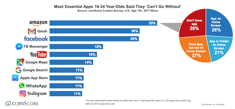
In 2016, comScore found almost half of all smartphone users in the U.S. downloaded a whopping average of zero apps per month. Yet in 2017, the Google Play store added more than 1,300 apps every single day.

null

Credit

Why so many apps? Mostly because it’s what everyone else is doing. Marketers aren’t exactly known for having a lot of chill when it comes to the tech du jour.
That’s not to say apps are dead in the water, but we are starting to see a trend which indicates people are using far fewer apps than are being put on the market daily.
App Annie’s 2017 research shows people use the same nine apps per day and no more than 30 over the course of a month. On average, users only touch as few as one-third of the apps they’ve downloaded.

Millennials especially are using utilities like maps and search engines along with apps for social networking, messaging, entertainment, and retail.

null

Source

When users do open an app, it’s no surprise it’s rarely that one that lets you drink beer … without the beer.

Bots don’t add to the onslaught of app, decision, or fake beer fatigue. Instead, they live right inside and actually enhance the functionality of some of the most popular messaging apps.

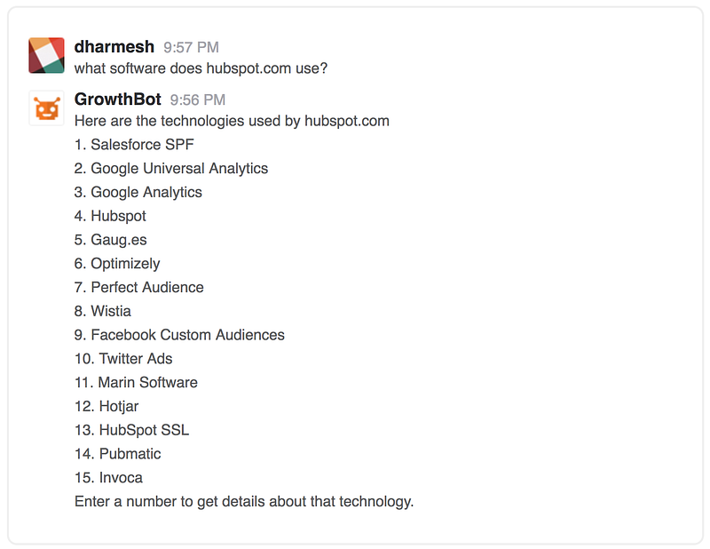
For example, GrowthBot helps users access tons of marketing and sales data using an app they probably already have open all day — Slack.

null

We have to agree with data scientist and software developer P. Daniel Tyreusin this case:

“I’m willing to speculate that it’s easier to acquire a user if the user doesn’t have to download a new app to use a service. I’m also willing to speculate that users are more likely to continue using a service that’s integrated into an app they already use.”

In the words of Seth Godin: If your target audience isn’t listening, it’s not their fault — it’s yours.

null

Before we even began building our chatbot, we focused on exactly how it would create value in a way no other tool could for our audience.

We work consistently to grow GrowthBot’s natural language processing (NLP) skills because we know our audience and we know how much easier it makes their lives when they’re able to access and compare tons of data by typing a few quick phrases into Slack.

NLP enables chatbots to understand what a user is looking for. It also allows consumers to enjoy personalized conversation instead of interacting with the same tired “intuitive” menu in a vacuum.

That’s important when your bot functions as a customer service rep, personal shopper, or research partner and conversation is the ideal way to answer a request.
Dennis Thomas, CTO at AI-powered consulting firm NeuraFlash, knows the importance of understanding how users interact with your chatbot.

“Another place where NLP is a big win is when the bot’s objective is focused on helping users with the discovery phase of products or shopping. Finding the right item via conversation helps to drive the user’s goal, as well as the product criteria to match to the company’s inventory.”

By the same token, NLP could actually be a detriment in cases where text-based chatbots can make the process simpler.

“When you have a visual medium and buttons can accomplish the task in a couple clicks (think easy re-order), open-ended natural language is not making the user’s life easier.”

We didn’t throw everything we’ve learned about our audience out the window when developing new bot software. Instead we implemented that knowledge to make GrowthBot just useful enough without being overwhelming.

We believe chatbots should be useful first and useful always.

null

NLP only accounts for half the conversation — the input part.

Output is just as important in terms of usefulness.

Your bot might have the personality of The Most Interesting Man in the World, but it will still suck if it can’t answer a user’s query.

You don’t need to build an entire search engine from scratch. You don’t even need to build an app. All you have to do is make sure your chatbot has access to enough data to prove useful in the niche you’ve chosen.

If it can’t do that, it’s no better than the aforementioned beer-simulating apps of the world.

GrowthBot has solid conversational skills, but it would be nothing without the marketing and sales data that help it achieve its goal — providing value to people who are growing businesses.

There are already tons of pieces of software and far too many apps for sales and marketing professionals. Useful chatbots don’t mimic, they empower users to find exactly what they’re looking for using a natural instinct: Simply asking.
Not spending hours customizing dashboards and poking through tens of different workflows just to uncover their own data. Simply asking.

Everytime we link a new database to GrowthBot, it gets more valuable for users. Right now it can pull information from dozens of sources; including HubSpot (of course), Google Analytics, MailChimp, social networking sites, and so on.

Bots are first and foremost data scanning machines. They take input, provide relevant feedback, and do so in a way that is easier to manage than any other platform.

“Products, like people, have personalities…”

null

David Ogilvy famously understood the importance of personality in products. We believe that’s also the case for brands and bots. That’s why we made GrowthBot sound like someone we know and like.

If your brand already has a solid personality, translate that into the voice and tone your bot uses when interacting with people.

If not, there’s no time like building a chatbot to determine whom you want to be in the online world.

Because there are so many tools out there that take the technical aspect out of building a bot, creating a great conversational flow might just be the greatest challenge you’ll face.

null

The messaging framework you build into your chatbot will influence the way people perceive the value of your brand, so give it some personality.

MailChimp is famous for its distinctly helpful personality that manages to be playful and humble at the same time. If your cat is wearing its very own monkey-themed knit hat right now, you know exactly what I mean.

null

Source

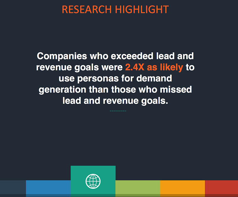
Cintell’s 2016 benchmark study on B2B buyers found that companies who exceed lead and revenue goals are two and a half times as likely to use personas than companies who miss lead and revenue goals.

null

Source

Today’s consumers have nearly countless brands to choose from. And they know it.
A well-defined voice that aligns with your ideal customer is an effective and low-cost way to develop return buyers and bot users.

For example, GrowthBot sounds like Dharmesh Shah — founder and CTO at HubSpot and loving father to the chatbot itself.

That means it’s light-hearted, respectful, and just a tad quirky all while being truly helpful.

We’ve found that a truly helpful voice in a world of chatter is more powerful than you might think.

Bots make life so simple, search feels painful

null

Google search has made an impact. There’s no denying that.

It’s almost a force of habit to visit a search engine to find what you’re looking for. Habits are notoriously hard to change, especially the more gratifying and automatic they are.

Current studies show it takes an average of 66 days for a behavior to become “unchangingly automatic.”

Because search behavior is second nature to us now, bots must do what a search can’t:

  • Provide customer service conversations and solutions without the wait
  • Deliver the information a user is looking for in just seconds, on the first try
  • Make recommendations based on powerful personalization
  • Aggregate information from a variety of sources right inside the apps we’re already using

That last point is what GrowthBot is founded on. We make growing your business easier by using the power of a chatbot to put information at your fingertips — not siloed in more apps and interfaces than you can count.

That’s just the tip of the iceberg of what AI-enabled bots can do with enough data and well-planned conversational flow.

But things can still go wrong if you aren’t aware of and managing your users’ expectations.

Where Facebook’s Assistant M Got It All Wrong

null


RIP

Chatbots are relatively new and their capabilities are varied. If you want people to love your bot, it’s important they understand why they need it and how to use it.
It’s not that Facebook’s Assistant M chatbot didn’t work. It’s that expectations weren’t managed; which overwhelmed the system and underwhelmed its users all at once.

“The first thing chatbots should do is quickly introduce their core competencies. Not only should chatbots start within a specific scope, they should always firstly tell you how they can help you and what they can do best.”
Instabot

Clarify upfront exactly what your bot is capable of. Provide specific examples and invite the user to try out a few practice questions. Don’t make them learn any new tricks right away.

Using your chatbot for the first time should feel like starting an online chat with a new friend or customer service agent.

There will inevitably be times when users ask your bot to do something it can’t do yet. Offer them an alternative, but don’t let that learning opportunity slip away.
Scan your chat logs regularly, they’re the most valuable market research you’ll ever get on what people want your chatbot to do.

Wait, have I mentioned value already?

null

Be on the lookout for every chance you can find to provide extreme value to your users.

Go above and beyond what people expect your chatbot to provide. Delight them with thoughtful little extras that make their days better.

Extreme value doesn’t have to stop when a user leaves your bot interface.

Offer to send customers an alert when their size is back in stock. Tell readers where they can find more articles like the one they just read on your website. Or, like us, celebrate with them every time you connect another tool that will make their jobs easier.

These kinds of interactions don’t just provide extreme value, they keep you top of mind and keep your customers coming back for more.

Nobody needs another app for this, that, or anything.

Instead, people need smart ways to accomplish more within the tools they already know and use regularly. When our chatbots deliver that level of service, we’re sure to start changing behavior and creating better automatic habits.

Fight back against bad bots. Build yours to be delightful to interact with, provide extreme value, and just not suck.

Originally published at blog.growthbot.org.

Unriddled: "Not a Media Company" Facebook Launches a Quarterly Publication, Apple Fights Election Interference, and More Tech News You Need

Welcome one, welcome all to another Wednesday: the day that marks the halfway point -- almost -- to the weekend.

The tech industry has seen quite a busy week, so we're bringing you another edition of "Unriddled": the HubSpot Marketing Blog's mid-week digest of the tech news you need to know. 

It's our Wednesday tech news roundup, and we're breaking it down.

Unriddled: The Tech News You Need

1. Facebook Launches Grow: A Print Quarterly Publication for Business Leaders

Despite repeated insistence from its leaders that it is not a media company, Facebook has launched a print quarterly publication in the UK -- Grow by Facebook -- which it describes as "a thought leadership platform shining a light on people, companies and trends that challenge the status quo." According to the Grow website, a permanent online "home" for the publication (which Facebook won't call a magazine) will launch soon, and feature content like niche brand case studies, as well as profiles of business leaders that achieved seemingly impressive feats. The Press Gazette's Charlotte Tobitt has more. Read full story >>

2. Apple's Fight Against Election Interference

Apple News -- which was rumored to be experimenting with products competing with those of Google News in April -- will now have a dedicated section for the 2018 U.S. Midterm Elections.

With a mission of "providing a new resource for timely, trustworthy midterm election information," Apple is drawing attention to a key factor that differentiates it from other tech giants who are fighting election interference, like Facebook: human editors.

(Twitter, too, announced on Tuesday new efforts to combat the spread of fake content and platform abuse -- largely through machine learning.)

According to its official statement, Apple will employ a "team of editors focused on discovering and spotlighting well-sourced fact-based stories," which will include exclusive pieces from the likes of the Washington Post and Axios, as well as coverage from televised news sources. Read full statement >>

3. The Less-Than-Successful Meeting of Big Tech and Intelligence Officials

Within the realm of preventing election interference, several representatives from eight tech giants -- including Facebook (which hosted the summit and recently published an update on its efforts to fight fake news), Apple, Google, and Twitter -- met with representatives from the U.S. Department of Homeland Security and the FBI to discuss how they can better fight election interference in the months leading up to November's midterm elections.

(Facebook, meanwhile, announced yesterday that it has removed 10,000 fake Pages, Groups, and accounts in Mexico and across Latin America because they violated Community Standards -- though it is unclear if the removal is related to possible election interference.)

The desired outcome, it seems, was to compare potential meddling activity each company had witnessed on its own platform to what U.S. intelligence has been monitoring and intercepting, as well. But those hopes were all but thwarted, with the U.S. government officials sharing no intelligence and leaving the business leaders assuming they would have to fight election interference without any federal intervention or assistance.

It's a particularly interesting outcome considering April's congressional hearings, in which Facebook CEO Mark Zuckerberg was challenged with questions about the potential regulation of the company, as well as its Big Tech peers. But that potential regulation -- should it materialize -- does not appear as though it will play a role in the company's efforts to cease the weaponization of social media sites by foreign actors. Sheera Frenkel and Matthew Rosenberg of the New York Times share more. Read full story >>

4. New Metrics Emerge for Time Spent on Social Media

According to new data from SimilarWeb, the average Instagram user spends about 53 minutes on the app each day, trailing closely behind an average 58 minutes on Facebook. (Snapchat, evidently, isn't too far behind, with an average of 49.5 minutes.)

The data comes at an interesting time, after recent announcements from Apple that it will include a Screen Time app in the next version of iOS to help users manage the time they spend using their phones. Not long after that feature was unveiled, Instagram confirmed it was testing a "time well spent" feature and rumors emerged that Facebook (which owns Instagram) is experimenting with similar technology.

But despite the efforts of the latter two apps to, on the surface, help users better manage time spent on them, both have released new long-form video products -- as well as newly-released group chat options and a redesigned explore tab from Instagram -- over the past few weeks that appear to be designed at least in part to encourage more time spent on each platform.  Recode's Rani Molla and Kurt Wagner explain why these metrics matter. Read full story >>

5. Uber is on Probation in London

Since Transport for London revoked Uber's license to operate, CEO Dara Khosrowshahi has spent much of his time doing "damage control" to repair the company's relationships in the UK, as well as in its U.S. homebase. Now, the ride-sharing company has regained a license to operate in London, after a UK judge ruled that it can legally offer its "digital services" there. But it might not be permanent -- the ruling comes with 15 months of probation, which is three months short of the 18-month period the company was seeking. Politico's Mark Scott has more. Read full story >>

6. Facebook Will Allow Cryptocurrency Ads Again

In a statement released Tuesday, Facebook announced it would once again permit the purchase and publication of "binary options, initial coin offerings and cryptocurrency." The new policy follows a January decision to ban any "misleading or deceptive promotional" content related to financial products -- which has been revised to allow such ads from pre-approved accounts only. Facebook and Google were among the first platforms to ban ads related to cryptocurrency, and were followed shortly thereafter by Twitter. Read full statement >>

That’s all for today. Until next week, feel free to weigh in on Twitter to ask us your tech news questions, or to let us know what kind of events and topics you'd like us to cover.

Featured image credit: Facebook

The 7-Minute Guide to Getting Started With Google Tasks

If you’re anything like me, you love to-do lists. Heck, sometimes you love to-do lists so much, you even put completed tasks on your list just for the satisfaction of crossing them off (No? Just me?).

Up until recently, I’ve been using my Google Calendar as my to-do list -- but it can get confusing, particularly when someone wants to book time with me but sees “buy salmon” already takes up most of the afternoon. Even worse, you can’t prioritize your Google Calendar to put more important tasks ahead of less important ones.

Fortunately, Google offers an alternative solution: Google Tasks, a tool which enables you to create to-do lists within your email, links those tasks to your calendar, and more.

Gmail has offered a Tasks tool for years, but with the new Google design, Tasks is sleeker and easier to use. Here, we’ll show you how to get started with Google Tasks in just seven minutes, on your desktop or phone.

How to Use Google Tasks on a Desktop

1. Log into your Gmail account. Click your “Settings” icon, as indicated by the arrow below, and then select, “Try the new [Gmail].” Since I’m on a work email, it says HubSpot, but it’ll say something different depending on your email account.

2. With your new updated Gmail, you’ll see a blue icon on the right side (underneath Calendar and Keep). Click the icon, labelled “Tasks”.

3. Click the blue “+” button to add your first task.

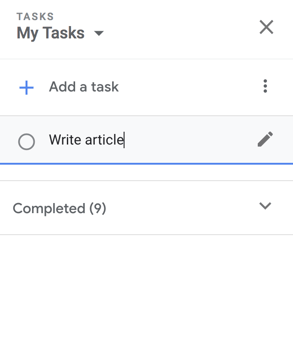
4. Now, type a task in the line beside the bubble and then click the “Enter” or “Return” key.

Screen Shot 2018-06-26 at 9.53.12 AM-1

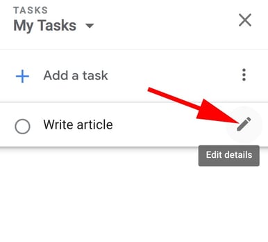
5. If you only need to add a basic task, you’re all set. However, the Tasks tool also allows you to edit your task -- to do this, click the pencil icon beside your task.

editdetailstask-1

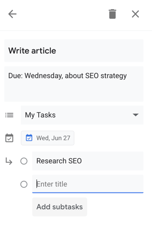
6. Here, you can add details including when your task is due (which will integrate into your Calendar), a paragraph box for your own notes, and the option to add subtasks if you feel the need to break up your task into parts.

Screen Shot 2018-06-24 at 5.39.40 PM

7. When you’ve completed a task, simply click the bubble beside the task. When you do, it will briefly show a check mark, cross itself off, and then disappear off your list.

8. You can also drag and drop your tasks to rearrange the order -- for instance, I dragged “Dinner reservation?” to the first item on my to-do list.

How to Add an Email to Your Google Tasks

If you receive an important email you’re too busy to answer immediately, you can add it to your Tasks list for later. Here are two different ways to do this:

1. Simply hold the email and drag it to your open Task list. You’ll see the email icon underneath the task, which, if you click, will take you to the email.

moveemailtasks

2. If you’re within the email when you decide you want to add it to Tasks, simply click the three-dot icon at the top of your email and select, “Add to Tasks”.

How to Use the Google Tasks App

If you’re often making to-do lists on the go, you might want to use the Google Tasks app supplementarily -- since it’s connected to your email, your tasks will sync up with your desktop Task list, and they’ll also integrate into your Calendar on both your phone and desktop.

After you download the app on your phone, here’s how to use it:

1. When you open the app for the first time, here’s what you’ll see (look familiar?). Click the blue “Get started” button.

2. Next, click the blue “Add a new task” button.

3. Using your phone’s keyboard, type your task and then click “Save” or “Done”.

4. If you click on your task within the app, you’ll have the option to “Add details”, “Add date”, or “Add subtasks”. For this instance, if I want to add my task to my calendar, I’ll click “Add date”.

4. A calendar will pop up within the app. Choose the date your task is due, and then click “Ok”.

5. When you add subtasks, you’ll see the bubble beside each task. When you complete a task, simply click the bubble.

6. To rearrange the order or change the dates of your tasks, click the three-dot icon in the bottom right corner.

7. Here, you can sort your full task list by customized order or date, rename the list, or delete all completed tasks.

Ultimately, Google Tasks is an effective organizational method, since it integrates seamlessly into other Google features including Gmail and Calendar. If you’re feeling overwhelmed filling up your calendar or sticky notes with to-do lists that range in level of importance, you might want to give Tasks a try.

Additionally, take a look at 12 Tools That'll Keep You Productive Morning, Noon & Night to further increase your efficiency levels.

The 5 Critical Components of Fantastic Lead-Capture Forms

Did you know that without a lead-capture form, your digital content can't generate leads?

The lead-capture form is the main focus of a lead-capture page -- better known as a landing page. The ultimate goal of this page is to get your visitors to fill it out with contact information in exchange for a piece of content, such as an ebook.

Click here to learn best practices for optimizing landing pages and generating more leads.

Because the formatting and design of your lead-capture form has a direct impact on your conversion rates, it's absolutely critical that you approach them wisely. Here are the five most critical components of successful lead-capture forms.

The Five Components of a Lead-Capture Form

1. The Lead Form's Positioning on the Landing Page

First of all, you should make sure your form appears above the fold or easily findable on the lead-capture page. In other words, the viewer should not have to manually scroll down the page in order to see it. Visibility is important, since you want to draw the visitor’s attention to the form. 

However, you don't want this form to spook visitors who are less willing to disclose information at first glance. To ensure the content you're offering is the main appeal of your lead-capture page, consider two different form positioning techniques:

Next to the Content Offer's Picture

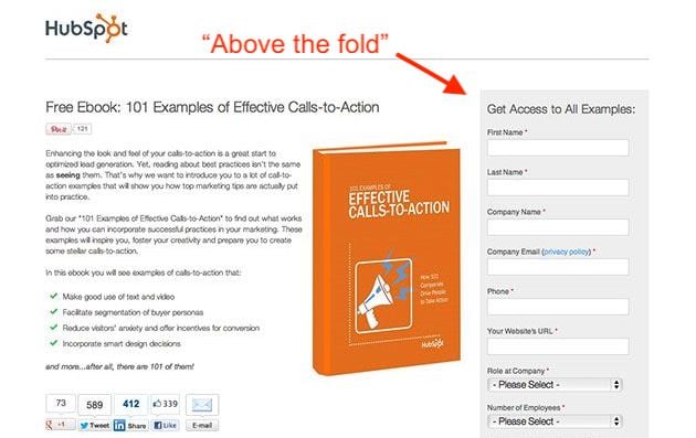
The form below might be above the fold, but it's not the most eye-catching object on the page -- the content itself is. Putting a picture of the content next to the form is an appealing reminder of what a user will get in return for his or her basic information.

HubSpot landing page with lead-capture form to the right above the fold

At the Bottom of an Auto-Scroll Landing Page

Still many of HubSpot's forms have lead-capture forms at the very bottom of the landing page.

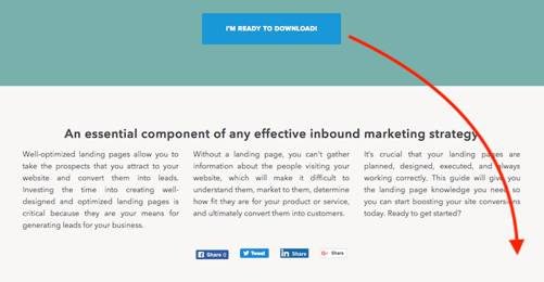
Why on Earth would you do that? This positioning ensures the content we're offering is center stage so a user can adequately determine if it's worth downloading. See what this looks like below:

download-auto-scroll-landing-page

If they decide they want the content, clicking the Download button shown above automatically scrolls them down to a brief form at the bottom of the page:

lead-capture-form

Once they fill out the form, they can confirm their download and retrieve their content.

2. The Lead Form's Length

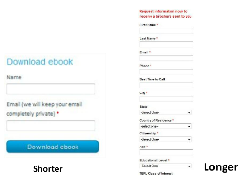
The next -- and probably biggest -- question when designing your forms is, how long should it be? This is a tricky question, because the length of your form inevitably leads to a tradeoff between the quantity and quality of the leads you generate.

A shorter form usually means more people will be willing to fill it out, so you’ll generate more leads. But the quality of the leads will be higher when visitors are willing to fill out more forms fields and provide you with more information about themselves and what they’re looking for. Therefore, shorter forms usually result in more leads, and longer forms will result in fewer, but higher quality leads.

The other critical factor to consider is the effect of the length of the form on the prospect’s willingness to fill it out. If the form is too long, prospects are going to stop and evaluate whether it is worth their time to complete all of those fields. So you need to find a good balance between collecting enough information and not asking for too much information that they’re not willing to give.

Shorter vs longer lead-capture form

3. The Form Fields You Use

Of course the next question is, what should those form fields be? What information should I ask for? Oftentimes, companies have forms on their sites that ask for way too much information (or the wrong kind of information). Your goal should be to collect enough information through your form to enable you to both contact and qualify the lead.

Contact fields in a lead-capture form

You can use fields such as name and email address to gather contact information about the lead. It is important to be able to follow up with your newly converted lead so you can put them into your sales funnel to try to convert them into a customer.

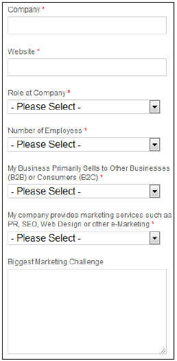
Lead-Qualifying Fields

Before you do that, though, you’ll want to be able to qualify the lead. To do this, include fields and questions in your form that will help you identify how strong that lead is – in other words, how likely they are to become a customer. You can include fields such as company, website, role at company, and number of employees to learn some basic background information. Then add in a question that will allow you to gauge their need for your product, their likelihood to purchase your service, or their fit with your company.

For example, HubSpot sells marketing software, and all of the forms on our landing pages include an optional field that asks visitors to describe their biggest marketing challenge. We use this information to learn more about and qualify our leads before putting them into our sales funnel.

Asking Only Essential Questions

When you’re deciding which fields and questions to include on your form, remember that you should only be asking for information that is essential to be able to contact and qualify them. You can always ask for more information later, and in fact, that is usually the better approach. Too often, companies request all kinds of contact information and ask tons of questions of their visitors, neglecting to realize that their 15-field forms are significantly lowering conversion rates.

4. Your Privacy Policy

This brings us to the next concern that prospects have with regard to filling out forms: security. Most people experience some sort of anxiety when asked to provide sensitive information, especially online. You need to show your visitors they can trust you with their information.

Link to your privacy policy next to the field that asks for the visitor's email address. Have your logo and a client testimonial visible. Use some sort of authority endorsement, third-party security certification, or guarantee seal. Just make sure that your website looks credible, and that should help to reduce friction for filling out your form.

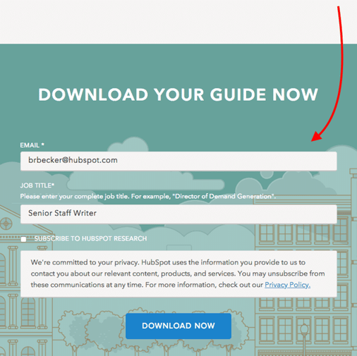
On our lead-capture forms, we offer a brief preview of our privacy policy right above the download button. See what this looks like below:

HubSpot privacy policy on lead-capture form above Download button

5. The Lead Form's Submission Button

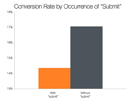
The last major component of your form is the button the visitor must press to complete the form and send you their information. The default text for this button is usually “Submit,” but studies show that landing pages with buttons labeled “Submit” actually have lower conversion rates than those that use other wording.

The top-performing variations in this study were “Click Here” and “Go.” Compared to “Submit,” these buttons feel much less committal and imply a lower investment of time and effort.

submit chart

landing-page-design-ebook