
This year will be an important one for ecommerce brands, hinging largely on one specific element -- customer experience (CX).
According to Gartner data, 42% of CEOs say that better CX was “the key change that has driven more wins.” Furthermore, for 80% of B2B customers, CX is the biggest influencer in the decision to work with a certain vendor. And, Walker insights indicate that by 2020, customer experience will overtake price and product as the key brand differentiators.
That data emphasizes the significance of CX, but what do online retailers really need to know about it? And with 89% of organizations competing on customer experience, what's the best way to stand out? 
In this post, we’ll explore those questions, and look at some examples of brands who already reap the benefits of building a strong online experience.
The Growth of Experience
To better understand why more brands are putting an emphasis on improving their CX, let’s discuss how it’s evolved. We’re already seeing CX come to the forefront in many different formats. For example:
- In 2014, Facebook bought virtual reality company Oculus for $2 billion in order to create new, more engaging experiences for its audience.
- Brands are seeing higher conversion rates by adding a seamless mobile checkout experience.
- Mindfulness is becoming increasingly important within leadership roles on every level, indicating that decisions are being evaluated differently than in the past. In fact, McKinsey cites observation of consumers as a crucial first step in creating better CX.
When we look at experience-related changes that are happening around us, the above examples are merely at the tip of the iceberg. But what we can glean from them is that online CX takes on much more importance than it has in the past -- in fact, 76% of consumers say they view this experience as the true test of how much a company values them.
So what changes can be made in the ecommerce world to improve the overall experience? Let’s look at some examples from ecommerce brands who are stepping up their online CX, and find the elements of their successes that we can learn from.
How Brands Can Improve Online Experiences
1) Marucci Sports
The Takeaway: Emphasize the Story
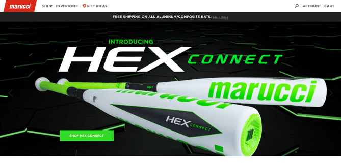
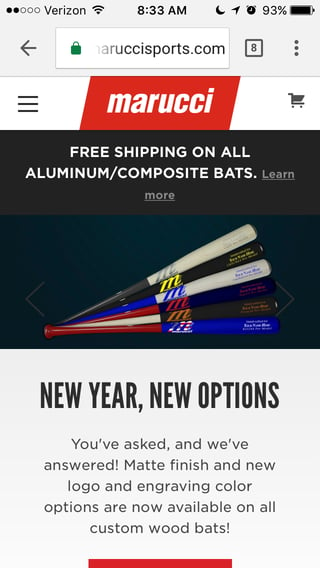
We can take a page from the book of Marucci Sports, the brand that redesigned its site to be both story-centric and mobile-friendly. Using strong visuals and compelling copy -- with responsive design -- to highlight relationships with players, Marucci was able to increase mobile conversions by 50%.
2) Di Bruno Bros.
The Takeaway: Enable Exploration
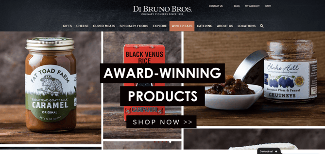
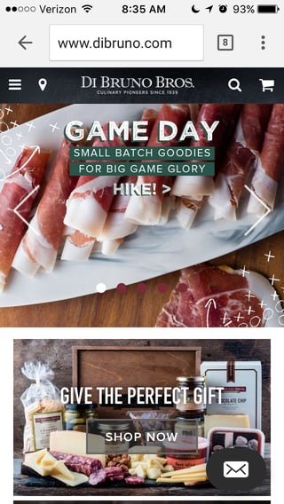
We can also learn from food and beverage brand Di Bruno Bros. -- and its site redesign -- which put an emphasis on a discovery-based CX. With detailed product descriptions and strong visuals, the brand makes it easy for visitors to explore offerings and gather the information they need to make a purchase.
It worked. After these changes were implemented, Di Bruno Bros. more than doubled its average conversion rate and boosted online sales by 6.5%.
3) BOXHILL
The Takeaway: Showcase the Product (and Earn Press)
When BOXHILL revamped its logo, the team looked to implement a new site design that would accomplish two goals:
- The logo was to appear front and center.
- The new design needed to showcase the products, pushing more customers to conversion, rather than losing them on what was a confusing journey across the site.
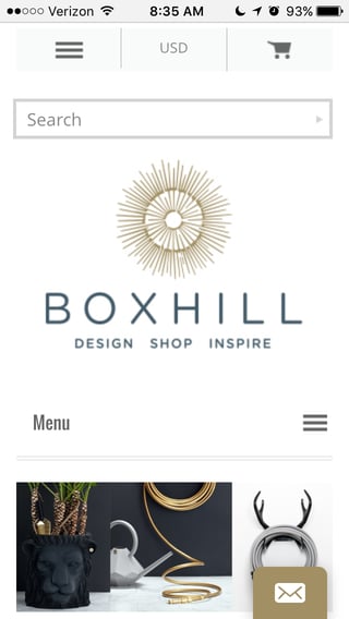
The use of white space, a centered logo, and a more modern site experience increased conversion by 410%. Even better? The publications and vendors BOXHILL was working to secure became more inclined to include the brand in mentions and roundups. With the new site design, BOXHILL earned coveted spots on outlets relevant to its brand, like Goop and HGTV Garden.

4) Andreas Carter Sports
The Takeaway: Remembering to A/B Test
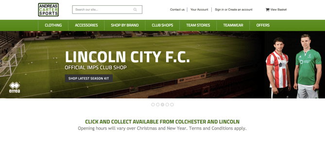
When Andreas Carter Sports relaunched its new site that was replete with a new look and feel, the brand saw nearly immediate results. That made sense -- customers would now be able to immediately view products in all available colors, for example.
But the Andreas Carter Sports team knew that additional changes could even further boost success. One of the biggest long-term modifications tested was changing the “Add to Basket” button color from black to blue. It worked -- during testing, that one change reduced abandoned carts by 50%, eventually leading to a change of the button color across the site.
5) Baby K’tan
The Takeaway: Learn From the Competition
Good site design isn’t created in a bubble. Online consumers grow used to certain functionalities -- things like the “hamburger menu,” which you can read more about here. At first, it was only used on a few sites, but was eventually adopted by many as a mobile best practice.
In some cases, your cometition might provide a certain experience that people have gotten used to -- but your site doesn't provide that experience. In that case, it’s good to do research to figure out what your site might be missing, which is what baby carrier manufacturer Baby K’tan did.
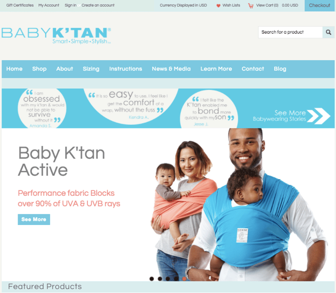
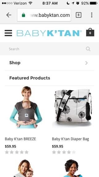
“Our site was inspired by a few favorite websites which helped us decide on a desired layout, and by our brand culture which revolves around family and expressing a cheerful emotional connection,” Tali Zipper, Baby K’tan’s VP of Marketing told BigCommerce. “We wanted something that was colorful, with bright and joyful images as well as a clean and simple layout for easy navigation.”
With these changes, site traffic grew 116%, and the brand saw a 45% growth in revenue.
Prepare for the Rise of Ecommerce Experience
As mobile usage continues to rise -- and begins to outpace desktop usage -- customer experience will be the focus for many ecommerce retailers. But with the statistics and examples we’ve covered, you can start planning your own customer experience improvements.
Think about which areas or your online presence can be enhanced for your particular audience, and put together an experience strategy that takes it a step further -- or better -- than competitors.
And remember -- observe your customers, imagining yourself in their respective places. What’s missing? What do you wish was there? Answer those questions, and you’ll be on your way to an action plan for CX that excels.

No comments:
Post a Comment