Photographs are emotional time machines: they transport us to places of which we’ve only dreamed, remind us of past experiences we long to recreate, and spark inspiration for future adventures.
It is not the photographs themselves that stir up these emotions, but rather the memories and aspirations we associate with them.
Instagram is a visual platform, so the best brands on Instagram understand the images they share are essential components to building their brands.
But beautiful images of their products aren't enough.
Instead, great brands use Instagram to share images that create genuine connections between their products, and the hopes and ambitions of their followers.
Tell a Captivating Story
Instagram is the perfect tool to create an emotional connection to your brand.
Instead of posting images that merely showcase your products, share images to evoke the feelings, dreams, and ideals you want associated with your brand.
Today, it’s fairly easy to compose and post beautiful images, but unfortunately, aesthetic beauty is not enough to be successfully marketable on Instagram.
The key to establishing a loyal and enthusiastic following is to use your Instagram images to tell a story that captivates and engages your followers and allows them to be part of the adventure.
Achieving both of these goals -- composing beautiful images and sharing them in an engaging and emotional way --takes some work. But with preparation and attention, you have the potential to curate a dazzling feed that will keep your followers scrolling.
Preparing Your Images for Instagram
There are four main ways your images can help or engage your followers. They can:
- Educate your followers
- Entertain your followers
- Assist your followers in solving a problem
- Motivate or inspire your followers
To attract attention, make sure your images tick at least one of the five categories below:
- Timely or topical: post about an upcoming event or festival that connects to your following
- Trending: post the type of content that is currently hot and trending on Instagram
- Original: post unique and imaginative content to set yourself apart
- Snackable: post content that is easily digestable while your followers scroll their feeds
- Actionable: include a call-to-action in your post, directing your followers to like, share, or comment on your image
Instagram Themes
To curate an appealing, cohesive feed, it’s important to select a consistent style for your posts. From crisp minimalism to bold and colorful, there are thousands of accounts you can draw inspiration from.
Here are some examples:
Minimalism
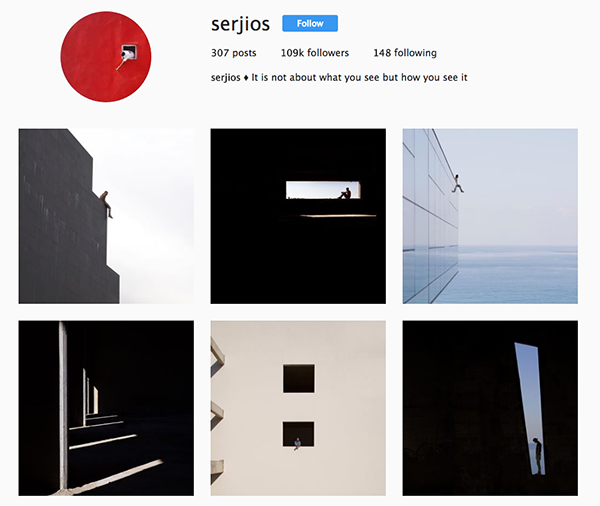
Black and white

Colorful
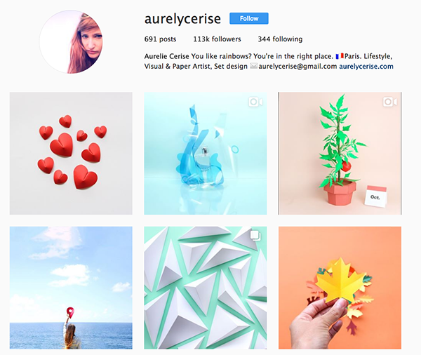
Collage
Staging and Composing Your Images
Now that you’ve decided on the style and emotion of your images, it’s time to introduce some basic photography tips to help you compose visually-appealing images that fit the tone of your account.
Size
Instagram images are 1080 x 1080 pixels. Instagram then resizes the images to 612 x 612 pixels, which display in users’ feeds as 510 x 510 pixels. On Instagram, quality beats quantity, so you should post photos that are at least 1080 x 1080 pixels. If you’re tempted to share smaller pictures, it’s better to do so on other social media platforms.
Color Scheme
When choosing a color palette, keep it simple. Share photos that use only a few main colors. These colors should remain consistent throughout your feed.
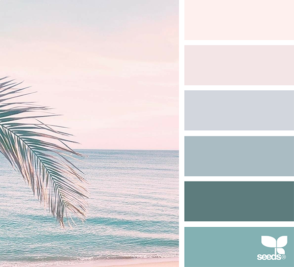
Design seeds is a great place to find inspiration for your color palette. In addition to this, you can also use Coolors.
Lighting
The best photos are taken in bright and natural light. If you’re outside, avoid shooting in direct sunlight. The best lighting conditions exist in early morning, early evening, and overcast days.

Image by Felix Russell Saw

Image by Chirobocea Nicu
Subject
The rule of simplicity also applies when choosing a subject. Some of the best shots feature a single, appealing subject. Because your photo will feature just one subject, it’s worth spending extra time to stage and restage the shot to ensure that you capture your subject from the most interesting perspective.

Image by Kelly Sikkema

Image by Ronald Cuyan
Negative Space
Many skilled photographers follow the rule-of-thirds when shooting their subjects, meaning they dedicate one-third of the frame to the subject and two-thirds of the frame to negative space. This helps draw attention to your subject.
Utilize the grid feature on your phone or camera to better understand the space within your frame and balance the space between your subject and background.

Image by Trey Ratcliff
As you can see from the photo above, the photographer used the grid lines to divide the photo into nine equal parts, placing the subject of the photo on an intersection of four grid lines. These intersections are naturally the most appealing focal points within a photo.
Your use of negative space can transform a good photo into an excellent one. Consider restaging the same photo a few times, to play with negative space, as well as different angles and different depths.

Images by: Lance Asper, Daniel Von Appen, Zia Syed, Simone Hutsch
Optical Illusions and Shapes
Take advantage of natural illusions like reflections to attract your viewer and create a sense of marvel and curiosity.

Image by David Marcu

Image by Ng
You can use leading lines to focus your viewer’s attention on a specific part of an image. These lines can be straight, wavy, or circular. Great examples of this principle in action are railroad tracks, spiral staircases, or forest trails.

Image by Sam Poullain

Image by Tobias Van Schneider
Creating symmetry in your photos is another way to draw attention to your images. Symmetrical images are people-pleasers, and very simple to compose.
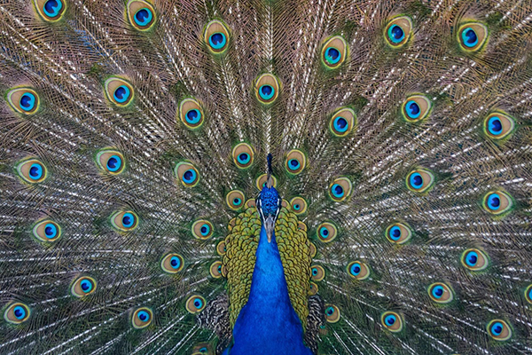
Image by Steve Harley

Image by Vincent van Zalinge
Repetitive patterns, geometrical shapes, and abstract textures are visually appealing effects you should use in your images. Consider mosaic tabletops, building facades, or fraying fabrics. Naturally-occurring patterns and symmetry are also very photogenic: think about the veins on leaves or a spider web.

Image by Andrew Ridley

Image by thr3 eyes
Begin paying attention to the photogenic details of your everyday life. With the appropriate use of lighting and negative space, you have the capacity to transform an intricate detail into a very powerful image.

Image by Pawel Blazewicz

Image by Darren Nunis
Post-Production
Filters
Now that you’ve staged and shot your image, it’s time to discuss the best way to apply Instagram’s filters. To create consistency within your feed, you should stick to using the same few filters for all of your posts.
Check out this video for a helpful tutorial on editing photos directly from your phone:
Using filters will help distinguish and draw attention to your Instagram photos. Take a look at these examples of types of filters:

Desaturated

Saturated
Image by Kyler Nixon
Bright and Minimalistic
Before

After

Image by Bench Accounting
Balancing Your Feed
Once you’ve chosen your filters and edited your photos, you’ll want to look at your feed in its entirety to be sure that, as a whole, it looks uniform and balanced.
Instagram is less about creating individual images, and more about curating a complete, coordinated, and consistent feed that captures the emotions you hope to communicate.
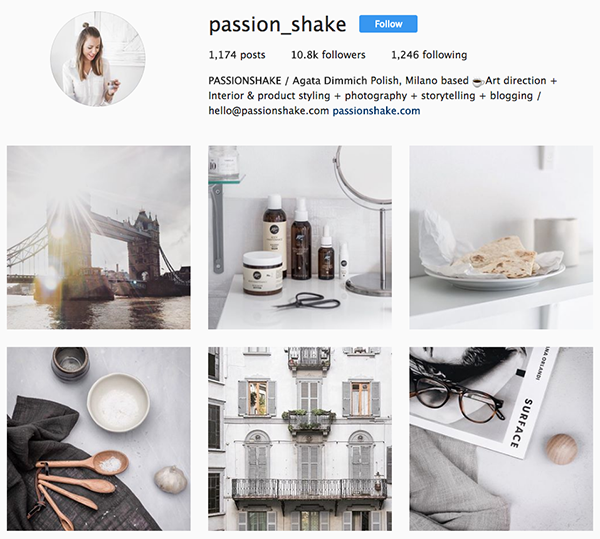
One of the easiest ways to ensure that your feed has a uniform feel and flow is to consider each new image you post in the context of the images surrounding it within your feed.
By focusing your attention on your previous photos, you will relieve yourself of the burden of considering whether each new photo you post matches the style of your entire feed.
Another way to create a good balance within your feed is to look at the level of detail in your previous images when you post a new image. If the previous photos are less detailed, consider posting a “busier” photo next.
Graphics
You can draw more attention to your images by adding graphic elements that overlay your photo:
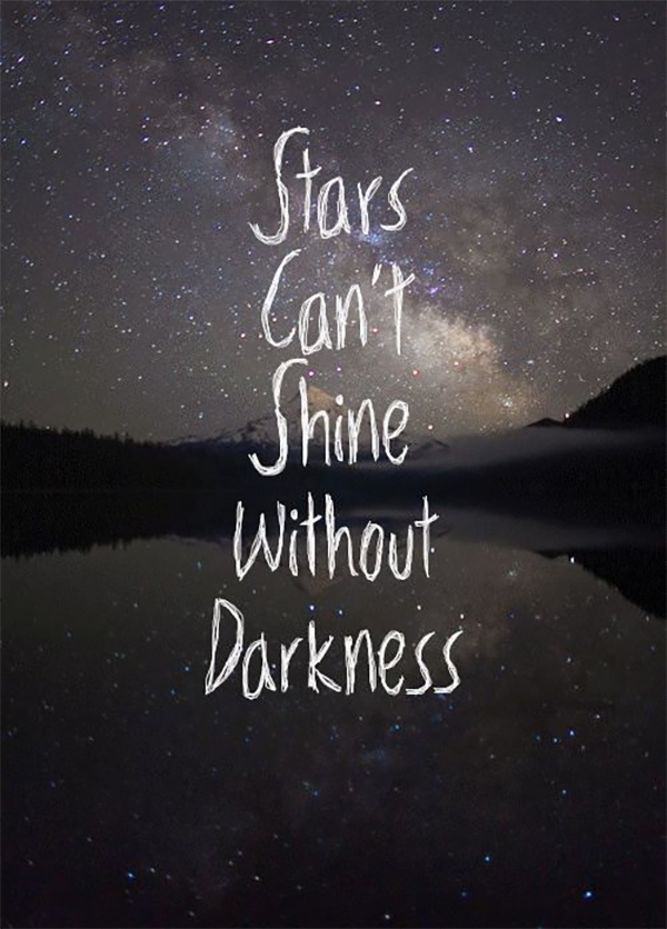
Canva and Easil are two web apps that will help you create fast and simple graphics to enhance your images.
If you choose to overlay your image with text graphics, limit yourself to one or two fonts, and make sure the font styles complement the feel and tone of your account.
Fontpair and Typ help explain which font styles work well together.
Take-away
In today’s world of high-quality smartphone cameras and dozens of photo-editing apps, it is becoming easier to create visually-pleasing images to share on Instagram.
But to sell your product and attract new followers, it is imperative that you compose and share photos that create emotional associations with your brand.
This requires both preparation and creative execution, but by following the simple tips above, you’ll have new followers scrolling and day-dreaming in no time.
No comments:
Post a Comment