
Think about your favorite book for a moment. How did it make you feel when you read it? Is that part of what made it such a compelling story?
My favorite book series is Harry Potter, and apart from the awesomeness that is a magical boarding school, the font in which it was published may have influenced my affection for the series.
You see, visual elements are just as important as the words on a web page or blog post. And fonts serve as a visual marketing tool for publishers to leverage when compiling their story. The font you choose ultimately plays a hand in conveying the message you want to send your readers.
In this post, we’ll explore how fonts can influence reader emotion and how marketers can use this information in their content.
Fonts vs. Typefaces: What’s the Difference?
“Font” and “typeface” are two terms that are often incorrectly used interchangeably.
A font is one particular weight and style of a larger typeface. Typefaces are categories comprised of many different fonts. For example, Serif is a typeface, and Times New Roman is a font that is part of the Serif family.
There are a variety of different typefaces and fonts. Here’s a quick rundown:
Serif
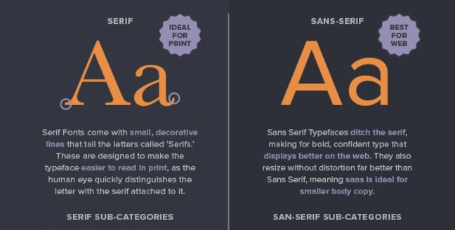
Serif fonts are identifiable by the small lines on the edges of letters (called serifs) that make the font easier to read in print.
Fonts in the Serif typeface include Times New Roman, Georgia, and Book Antiqua.
Sans Serif
Sans serif font letters don’t have a serif attached to them, so they display more clearly on websites.
Fonts in the Sans serif typeface include Arial, Verdana, and Helvetica.
Here’s a diagram of the difference between Serif and Sans Serif:
Source: CreativeBloq
Script
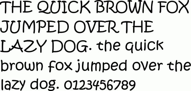
Fonts in the Script typeface are meant to imitate the fluidity of human handwriting.
Fonts in the Script typeface include Comic Sans, Kristen, and Lucida.
Here’s an example of Kristen below:
Source: FontsPlace
Modern or Display
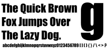
The modern typeface is characterized by variance between thin and thick bold lines in the lettering.
Fonts in the Modern typeface include Impact, Rockwell, and Agency.
Here’s an example of the Impact font:
Source: FontCo
Monospaced
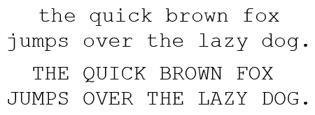
Monospaced fonts have larger spaces between each letter and were designed to look like text was written using a typewriter.
Fonts in the Monospaced typeface include Courier, Consolas, and Monaco.
Here’s what Courier looks like:
Source: PrePressure
These different typefaces and fonts are widely used across the internet, and research has been conducted about the impact of fonts on communication and overall perception. Let’s dive into the data and see if you agree with their findings.
Which Fonts Connote Which Emotions?
Wichita State University’s Software Usability Research Laboratory conducted a survey in 2006 to determine if different fonts had different emotions and personalities associated with them.
In the survey, they asked more than 500 participants about their perceptions of a variety of different fonts across the typefaces outlined above. The fonts that respondents answered questions about were:
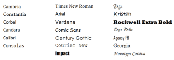
Source: UsabilityNews
Different uses of each font were evaluated in the survey, such as emails, letters, spreadsheets, web pages, headlines, and news articles.
Respondents were then asked to assign personalities and emotions to each font, and the results were organized according to personality factors that the different fonts shared most frequently. The fonts within specific typefaces ended up grouping together, as you can see in the diagram below:

Source: UsabilityNews
The study then produced a detailed breakdown of the fonts most commonly associated with both positive and negative emotions and personality traits. The results are intriguing:
- Serif fonts were rated as “stable,” “practical,” and “mature.”
- Sans serif fonts didn’t receive any particularly positive or negative personality associations.
- Script fonts were perceived as “feminine,” “funny,” and “casual.”
- Modern fonts were categorized as “masculine,” “assertive,” and “coarse.”
- Monospaced fonts were called “dull,” “plain,” and “unimaginative.”
Here’s the full breakdown of the top three fonts for each emotion and personality trait in the survey:
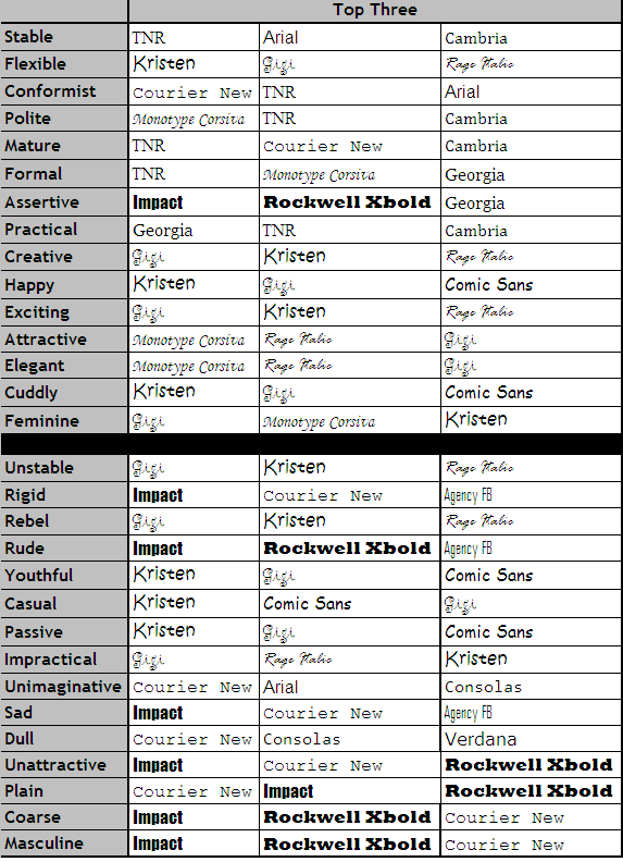
Source: UsabilityNews
While that study provided some interesting insight around the way people view specific fonts, there are numerous other studies and theories that point to why certain fonts connote specific emotions.
For example, in a 2014 study, medical patients received the same set of at-home care instructions in different fonts, and the harder-to-read fonts made patients think the tasks were harder to do. This is an example of cognitive fluency, a theory that posits when our brains have difficulty processing information, the task at hand appear more challenging.
Similarly, a 2008 study, in which participants were presented exercise instructions in hard-to-read fonts, revealed that the challenging font choice made the task seem to require more time to achieve.
The lesson? Based on cognitive fluency, if something is easy to read, it also seems easy to do.
But that's not all. The semantic memory associated with fonts also influences how readers feel about the fonts and the content they’re reading. For example, the Helvetica font is used on United States tax and Internal Revenue Service forms, which influences how the font is perceived -- depending on their experience with the federal tax system.
All of this is to say that there are numerous theories surrounding the psychology and emotional response to different fonts. In marketing specifically, fonts can capture your audience’s attention and help reinforce your brand’s messaging, so let’s dive into some actionable takeaways for content marketers getting ready to type.
3 Takeaways for Selecting Fonts to Use in Your Marketing
1) Choose fonts strategically by focusing on readability and legibility.
Creative Bloq created an infographic that outlines many factors to consider when choosing fonts for different projects, and they found a few trends in which fonts are widely used specifically among blogs:
- 20% of blogs use Georgia (Serif) for header text
- 10% of blogs use
 (Sans serif) for header text
 - 10% of blogs use
 (Sans serif) for header text
 - 20% of blogs use Arial (Sans serif) for blog body copy
- 10% of blogs use Helvetica (Sans serif) for blog body copy
Sans serif fonts are particularly clear to readers: Without the serifs on the lettering, Sans serif fonts like Arial are easy to read even on small screens, where users are spending a lot of time online these days.
Based on the research, fonts on your web pages and blog posts should be clear and easy-to-read. In fact, the simpler the better -- that way, articles will be readable on a variety of different screen sizes, and your content won’t be associated with difficulty or inconvenience. Below, you can see that The Atlantic publishes articles in Proxima Nova, a Sans serif font that is one of the most popular fonts among internet publications.
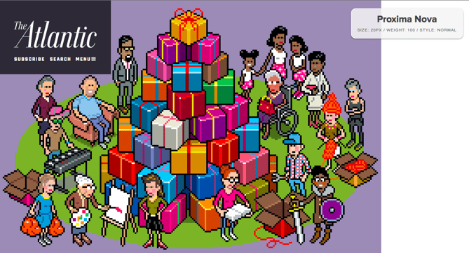
Source: The Atlantic & Fount
2) Use typography that communicates to visitors who you’re looking for.
If your goals include attracting a broad audience to your website, use typography that makes your content as universal and accessible as possible.
On the other hand, if your content is meant to communicate particular emotions and messaging, you can communicate that with your font choices.
For example, childish, playful fonts like those in the Script typeface may be the right fit for children’s clothing websites. Below, you can see that a Serif font was the right choice for Pottermore -- it makes readers remember the classic Serif font used in the Harry Potter books themselves.

Source: Pottermore & Fount
3) Remember: Things seem easier to do when they’re easier to read.
Make sure that fonts for your calls-to-action, headlines, and landing pages are bold, clear, and motivate site visitors to fulfill the task you want them to with your content. Here at HubSpot, we used a clear Sans serif font for our homepage and calls-to-action to make the information crystal clear to site visitors.
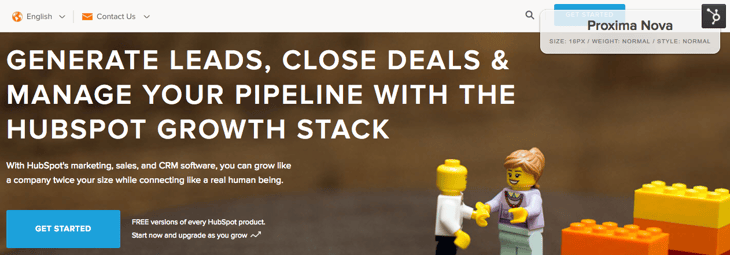
The visual elements on a web page are just as important as the content you’re writing about, so experiment with different fonts that send the right message and elicit the feelings you want from your audience. When you’re ready to start typing, read more about how to choose typography and text layout on our blog.
What’s your favorite font to use for blog posts, landing pages, and calls-to-action? Share with us in the comments below.

No comments:
Post a Comment