
At INBOUND, we launched a major iteration of HubSpot.com. Since then, we've been monitoring performance, running experiments, and collecting a substantial amount of performance data.
We can now confidently say that the results are in, and we have some big learnings to share with you. So let's get to it.
Like most major projects at HubSpot, this one began with compelling data that pointed to a few big opportunities in our site. While we're always iterating on HubSpot.com, we tend to push one or two major iterations per year, resulting from the culmination of these incremental learnings. In this case, we were focused on:
User Experience
HubSpot.com was suffering from what I like to call Design Debt. This is what happens when you run a bunch of experiments and the site is performing well quantitatively, but the experience of using it just isn't all that great.
Design patterns may be inconsistent, navigation flows may feel disjointed, and critical parts of the site may end up looking like they were an after-thought (that's because they were). When this happens, you have to refactor your site and scale your learnings across the entire design, creating an updated and consistent experience.
Conversions
By applying the learnings from our individual experiments across the site, we knew that we'd be able to increase conversion in a meaningful way and build a strong foundation for CRO efforts going forward. Experiment results shouldn't live in isolation; they need to be distributed across teams and designs, and we were ready to do that in a big way with this project. But perhaps more importantly, our product was changing.
Multi-Product, Internationalization, and Accessibility
Prior to INBOUND 2016, we knew we would be launching the HubSpot Growth Stack, which includes free versions of all of our products. This meant our conversion flow would be fundamentally changing -- not just for US customers, but for every HubSpot user around the globe. It was an incredible opportunity to reassess how we introduced our product, and brought users into it.
Ultimately, we would be rethinking our approach to HubSpot.com altogether. An initial audit indicated that this would require a refactoring or redesign of around 70 critical pages on HubSpot.com. And it would all need to happen over the course of 3 months, in time for launch at INBOUND.
But we didn't just begin with such an ambitious and resource-intensive project based on some data and a few hunches; we still needed to prove out the concept with a live MVP (minimally viable product), and ensure that it was the right thing to do.
Proof of Concept
Over the course of a few days, Matthew Barby and I silently launched an MVP with HubSpot Sales. We wanted to see what would happen if we took all of the data, hypotheses, and wild ideas that we had and put them into a single design without reservation.
I'm talking illustrations, big drop shadows with simulated depth of field, colors that broke our style guide, new CSS animations, copy with a completely different tone of voice, atypical CTAs -- you name it. We put it all in there, no holds barred.
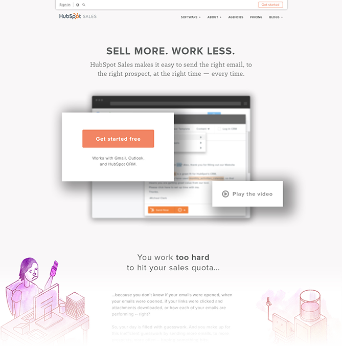
A look at the MVP design.
And it worked. The conversion rate was over 20% higher than the control, and user testing favored our new approach. This was a good indicator that we would benefit from rethinking HubSpot.com, and so we decided to proceed with the project.
Predictably, in further testing after the project launched, we also discovered we did plenty of things wrong (I got a little too intense with those drop shadows). As it turns out, there's a reason why two rogue individuals don't generally determine the design direction for an entire company. But we weren't after perfection here -- we would chase that later when we brought the proper team on board. This time around, we just wanted to prove out an idea, and we were able to do that.
Kickoff
We formed a small "SWAT Team" of individuals who would have autonomy over their areas of expertise in the project. This included CRO, SEO, copy, data analysis, design, development, product research, and project management.
Three executive stakeholders were then selected to make the final call on approvals and major decisions. That may sound like a lot of people, but for a public company with over 1,500 employees, it's pretty lean. Pro tip: In big companies, keeping teams small and focused can help avoid scope creep.
Research
Before designing anything, we dove deeper into research, expanding upon the insights that we already had. This started with a comprehensive audit of our conversion flows.
Each product had multiple unique flows, some of which were considerably more complicated than others (ranging from three steps to seven). Products that had less conversion flows and less steps in those conversion flows would convert at a rate that was 2 to 3 times higher than their more complex counterparts.
Our learning here was simple: we needed to consolidate our conversion flows and drastically reduce the steps from landing on HubSpot.com to being inside of the product.
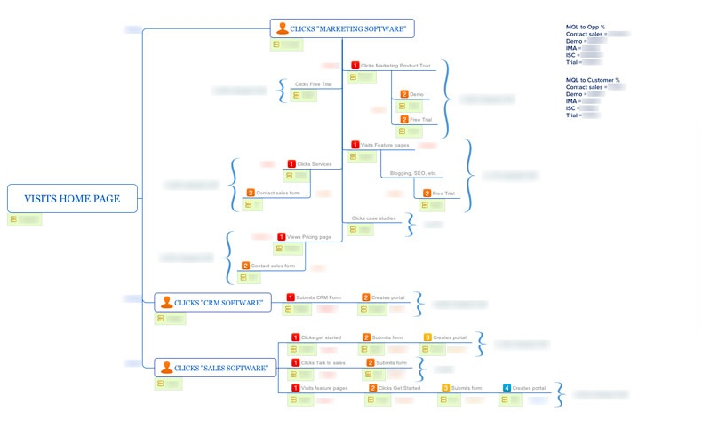
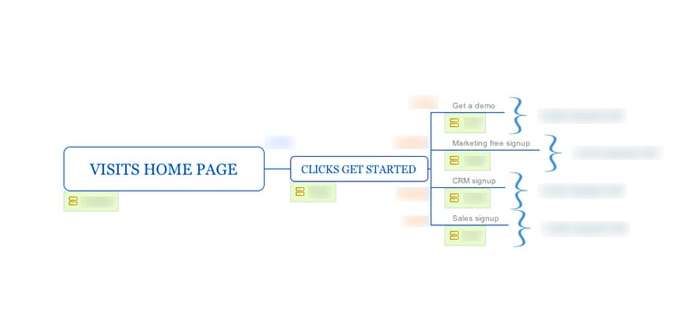
A look at our conversion flows before and after we simplified them.
We also started to look at our user journeys in HubSpot. This gave an idea for how these conversion paths were playing out for actual users, and it helped shine a light on areas where the process was confusing.
People were sometimes even unsure about which product they were signing up for. In particular, many were struggling to understand how HubSpot CRM and HubSpot Sales worked together. User interviews with non-customers, paying customers, and HubSpot employees helped pinpoint what could be improved.
I didn't continue the process because your website is too damn cluttered. It doesn't flow; it makes no sense. I can't make any sort of decision as to how or if this would benefit my company.
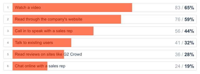
We're big fans of direct, honest, and even atypical feedback. So we took this stuff to heart and conducted follow-up interviews with outliers and customers that fit the profiles we were trying to learn about. Couple this with a few studies on how users preferred to learn about products (and what would make them convert), and we had some pretty interesting data to work with.
When evaluating software, how do you prefer to learn about it?
This all resulted in the creation of a new, simplified conversion flow that featured a "Get Started" CTA on the homepage and in the global navigation.
Once clicked, it would take visitors to a new "Get Started" flow, where they would have the option to request a demo of HubSpot Marketing, or sign up for each of our three free products.
With this new conversion flow mapped out, we focused our attention on 39 core HubSpot.com pages. This was an important development; while we initially were looking at around 70 pages, we soon were able to identify the most critical pages that we could reasonably tackle in our aggressive timeframe.
Content and Copy
A cornerstone of this project was that we used copy-first design, meaning that the copy would inform the design (not the other way around). To achieve this in such a short timeline, our copywriting was done in tandem with wireframing to ensure that designs were supporting and amplifying the messaging laid out in the copy.
We knew we needed to craft copy that explained the value of our products using language that was easily understood by our users. And given that we've found it can sometimes be difficult for visitors to understand what HubSpot actually sells, we also wanted to make it clear through our copy that HubSpot sells software – both marketing and sales, as well as a free CRM.
Last but not least, we wanted to show how each of our products were powerful alone, and even better when used together, which supported our new Growth Stack positioning.
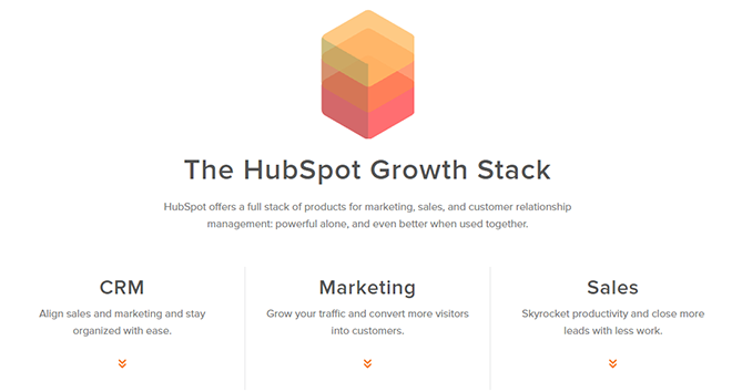
In previous copy vs. copy tests, we had seen conversion rate increases in the neighborhood of 20%. So it was inevitable that this would also play a role in helping us to hit our CRO goals. For this reason, the positioning of our new copy relied heavily on the data that we gathered during research, as well as guidance from our product marketing team.
We've come to identify high quality research as the primary determining factor in the success of copy. The best copywriters are also great researchers.
Evaluating Design
Armed with proper context for the project, we returned to our MVP and started to consider how it would influence our new design direction. Structurally, we knew the design was pretty solid. But we needed to make sure everything looked right, too.
The truth is, aesthetics can be a difficult thing to get right, and an even more difficult thing to measure. Oftentimes, we'll get caught up in subjective debates over what we personally think looks best. But if we reposition the way we think about aesthetics, we can get pretty close to measuring them objectively.
The main distinction is this: The best aesthetics account for what the users consider to be beautiful more than what the stakeholders consider to be beautiful. And that's something we can measure.
So we launched qualitative tests using our exploratory design (to see how it was doing), our current designs (to get some benchmarks), and designs that we admired (to see what we should really aspire to). We learned that we were on the right track, but a few of the things that we loved had to go:
Illustrations
Despite the fact that we internally loved the idea of using illustrations in our designs, they didn't test well with users. We tried a range of different styles, color schemes, and characters. In the end, users just couldn't agree on an illustrative direction.
Some loved them and others thought they were childish and unprofessional. So we removed the illustrations from the design, with a plan to run some tests around them in future iterations.
Intense drop shadows and visual treatments
While it's tempting to implement the latest trends, the truth is that many users don't understand or appreciate those trends. Across the board, clean and conservative designs performed better than their more "design forward" counterparts.
Truly, it is both eye-opening and humbling to run tests like these. I can't stress enough how important it is to let the your audience influence your design direction more than yourself. They offer a completely different and, in many ways, invaluable perspective.
Wireframes and Mockups
We quickly moved into building out our new designs and styles. Because we needed to create a truly scalable design, we worked on a template level, producing numerous iterations of each design.
This would mean that styles could be updated globally as we iterated in the future. I started by creating and testing different wireframes, while the talented David Carberry and Amelia Towle worked on the visual direction. You can see an example of this process here:
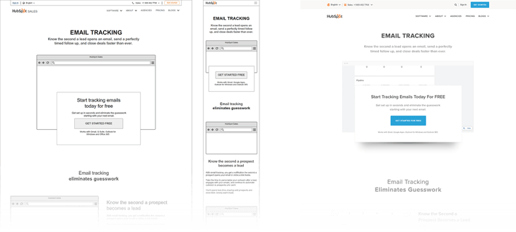
Wireframes and mockups
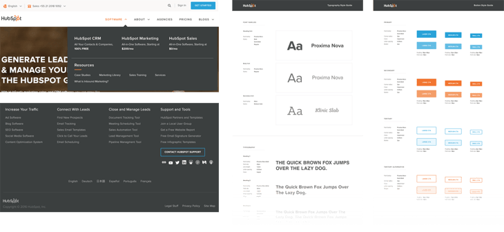
Global header, footer, and CSS
This resulted in over 100 wireframe iterations, 60 visual designs, and 4 full InVision prototypes. That's partially because we were constantly testing and refining our designs, and partially because we were working on an aggressive timeline where copy and design were being created in parallel.
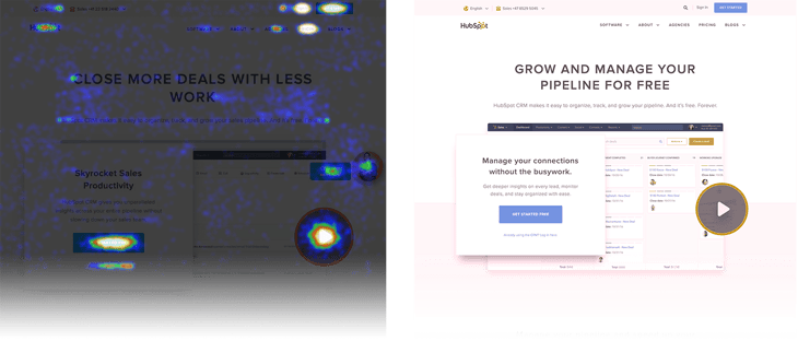
Click heatmap and Deuteranopia color blindness simulation
We then ran our designs through final conversion, aesthetic preference, and accessibility testing before touching any code. As we were doing this, we simultaneously produced assets like product images and videos to finish out the content that would populate the designs.
Video
From our research, we learned that 65% of our users preferred to evaluate software by watching a video. For each of our main product overview pages, we created custom tailored videos. Additionally, we leveraged auto-playing MP4s to demonstrate each of the products on the homepage.

Heatmaps showing video button clicks on the MVP and the final design
We can see here how even in our original MVP, the video CTA was a point of high engagement. This trend continued as we produced more iterations and final designs.
After launching the site and tracking the relationship between video engagement and conversions, we found that the presence of video increased our conversion rate by 300%.
Development
This was a major development undertaking, even for HubSpot's standards. Over 130 pages would be published across .com, .es, .de, .fr, .jp and .br at INBOUND. This included updates to our pricing, contact pages, demo and sign-up flow, and international product pages.
But more importantly, of those 130 pages, 39 of them were brand new core pages on HubSpot.com. This included a new homepage, "Get Started" conversion flow, overview pages for every product (four in total), two integration pages, and feature pages for every major feature (31 in total).
Plus new typography, global style guide elements, faster load times, a smart sales line, an updated live chat experience, an all new navigation and footer, and several unique experiences on mobile. Oh, and it all had to launch perfectly during Christopher O'Donnell's INBOUND keynote.
The team worked overtime to ensure that we would not only have a smooth launch, but that it would exceed the standards that our audience had come to expect. Of the 130 pages that we had planned to launch, every single one of them went live on November 9th during the keynote. CSS assets were reduced by 67%. The new site was alive and healthy.
Results
Upon launch, we began tracking over 90 different conversion paths. Using a roubst implementation of HubSpot Analytics, Google Analytics 360, and Amplitude, we've built a dashboard that pulls in every key metric across the website on a daily basis and lets us know how we're doing. After allowing the data to run, we've discovered that:
- We doubled the conversion rate of HubSpot.com with our new "Get Started" flow
- There was a 35% increase in demo requests by total volume, which are high quality MQL's for our product
- This is supported by the fact that our new demo landing page design is converting 57% better than the previous design
- Sales chat volume increased by 38% and inbound call volume doubled, meaning that more users are going through channels that have a very high close rate
- This ultimately resulted in a 27% increase in product signups by total volume, which translates into more revenue and retained users for the business
We place this project amongst our growing list of confirmations that a strong focus on User Experience and Conversion Rate Optimization will drive the greatest performance impact on a design.
Multi-disciplinary teams that think beyond the pixels and understand not only what they're designing, but why they're desinging it, are positioned to create the most thoughtful and impactful solutions.

No comments:
Post a Comment