Your pricing page is one of the most important parts of your website. It's where all your effort in building a relationship with your customer finally leads to a sale.
But I've seen enough badly designed pricing pages to know that some businesses simply don't know how to sell their offer. They either get confused on how much to charge, especially if they offer services, or don't know how to demonstrate value on the price page.
Knowing the fundamentals of a good pricing page is important because simply copying the pricing page of another business without understanding why it's designed the way it is, will only lead to a poorly optimized page.
Businesses too often forget the human element. Even though we buy all the time, when it comes to selling we forget the internal processes we go through before making a purchase.
In this post, I'll share nine best practices to ensure your pricing page does what it's supposed to do, make sales happen.
9 Pricing Page Best Practices
1. Keep your language simple and straightforward.
Buyers don't like confusion. They're about to give you their hard earned money and they want the entire process to be as clear as possible. In essence, they want to know what exactly they're paying for and what it's going to do for them. Your pricing page should clearly convey what your product or service will do for the buyer. Your pricing page is not the place to get witty or show expertise with hard to grasp grammar.
Making your pricing page as simple as possible should be at the core of your entire design.
The SaaS DNA project found that ease of understanding is crucial for visitors, so the best pricing pages for companies are often the simplest. The study recommends that pricing pages should stick to simplicity.
Dollar Shave Club is a brand synonymous with humor and eccentricity. Yet even they know that clear, easy to understand language beats being witty when it comes to talking price.
2. Limit your pricing plans to a few options.
The theme of simplicity extends beyond language. Even your price plans should be easy to understand. While this can be difficult if you serve multiple customer segments, complex price plans do limit sales. The less your buyer has to think before choosing a plan the better your conversion rate will be.
Take a page from Groove, they initially had a complicated pricing page that had a conversion rate of 1.17%.
And their conversion rate increased by 350% when they simplified their pricing page.
Due to the nature of what you offer, having one price plan isn't always an option. You can fix the issue of complex pricing by offering a customizable plan instead.
You can do this by offering: A 'contact us' option for enterprise: Where people can get in touch for a tailored plan.
Sliding scale plan: Where buyers can view price and features with a simple interactive element.
Campaign Monitor captures the essence of a customizable plan with both a sliding scale and an option for more demanding businesses. They save their customers from going through an otherwise complicated buying process.
3. Reduce friction points.
Friction points, also known as FUDs (fear, uncertainties and doubts), are factors that keep people from buying -- and you've probably experienced them yourself as a buyer.
There are several ways to reduce friction points:
Add FAQs to your pricing page
Have a chat with your customer service team and create a list of the most common questions potential buyers ask and answer them on your pricing page.
Include live chat
Something that's becoming more popular by the day, is presenting buyers with an option to speak with a sales rep. Especially if you sell expensive products, buyers can get questions unique to them answered in a personalized way.
Offer a free trial or money-back guarantee
Before purchasing most people wonder if a service or product will meet their particular need, this objection might be strong enough to make them cancel a purchase. Businesses avoid this by offering a free trial for services or a money back guarantee for physical products.
Include testimonials
What other people can say about your business matters more than anything you can say about it. When people see others like them achieving success with your product they feel more confident about buying.
Adespresso deals with friction points on their pricing page by offering testimonials, answering FAQs and displaying the logos of companies already using their service.
4. Utilize price anchoring.
Imagine you're in a store for a watch and the store clerk shows you a $20,000 watch, your pulse quickens, then she displays the $12,000 variety and then finally a $2,000 watch. Psychology tells us that you'd probably see the $2,000 watch as cheap even though on it's own you would've judged its price as too high.
A study conducted by the University of Arizona revealed that participants were more likely to judge a house as a bargain when it was placed next to an identical building with an artificially inflated price. Regardless of whether they were inexperienced undergrad students or real estate experts. This is because we tend to judge things based on what we were exposed to prior.
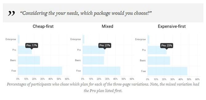
Price anchoring is applied in pricing pages by displaying the most expensive plans first. To test the effect of this on pricing pages, Conversionxl conducted a study and used task scenarios, eye-tracking and survey tools to gather feedback.
The result of the study revealed that participants chose more expensive packages more often when they were listed first, or furthest left in left-right order.
They found that why people generally took in the information at the same, listing the expensive plans first on the left resulted in longer ‘dwell times’ on the page. Overall the first two positions received the most attention.
Here's a bar graph of the results when participants were asked to choose a plan.

The participants chose the Pro plan more when it was offered first.
Here's how Unbounce, a company that knows a thing or two about optimization, designs their pricing page.
5. Highlight a recommended plan.
You know better than anyone what option would fit the needs of the majority of your customers. Reduce the confusion faced by buyers by highlighting a plan you think will be a good fit for the majority of visitors.
It shouldn't just be your most expensive plan though -- it has to be a price plan that based on evidence, most of your customers will derive value from. And there's proof that highlighting a plan works to reduce pricing page friction and buyer confusion.
Another study conducted by ConversionXL examined how highlighting a recommended plan impacted results.
Here's a table showing the results of the study.
The major takeaway from the study is that participants chose the PRO plan more often when it was highlighted, especially if it was placed in the expensive first order.
6. Add the number nine to prices.
Also known as psychological or charm pricing. It's based on the theory that certain prices have a psychological impact. And you've probably seen this effect used in grocery stores and car slots.
Though not supported by everyone, some studies do show that charm prices work, for example, an experiment conducted by MIT and the University of Chicago found that clothing items at a women store sold more when it was priced at $39 than when it only cost $34 and even $44.
In another study, Gumroad shows how the number nine improves conversion rates.
7. Make the CTA prominent.
The CTA is crucial to the success of your pricing page. Your CTA has to stand out and clearly convey what you want your readers to do. It shouldn't be blocked by features and price.
Also, the wording in you CTA matter, for example, research done by HubSpot found that the word ‘submit’ negatively affects conversion rates.
Your CTA has to be in essence: Prominent, actionable, and specific. The best CTAs start with a verb and tell the reader what they'll get by taking action.
Here's how Sprout Social does it.
8. Improve information and action
The SaaS DNA project, which I cited earlier, also revealed that pricing pages that had the most information and were action-oriented resulted in more confident users who in turn converted better. The study showed that pages that lacked either information or action resulted in lower conversions.
The study advised that for a pricing page to be both informative and actionable people should be able to connect the dots between what each plan offered, and how they would actually apply the offerings in their own lives. An indicator that you're on the right track, is if a new user can understand your pricing page.
Here's an example from Box, a company that ranks highly in the SaaS DNA high information and action category.
Easy to understand and actionable.
Box not only segments pricing by customer base so as not to overwhelm buyers, but each section clearly tells you what you get and how to get it.
9. Never stop testing.
As with anything in optimization, you have to keep testing. What works for one company might not work for yours and the only way to make sure that the features you implement are the best they can be is to test continuously. But these best practices provide you with guidelines to help you decide on what features to implement in your pricing page for better conversions.


No comments:
Post a Comment