Are you looking to create an awesome resume that lands the job of your dreams? Whatever industry you’re applying to work in (from marketing to sales), there’s one thing all resumes need to have in common: the ability to stand-out.
But, this uniqueness doesn’t mean you need to make your application uncommon — especially when you’re using a template.
Resume templates allow job seekers to put together a unique one-page document that’s proven to get results. The best part? Even a non-designer could whip-up an incredible resume template in a matter of minutes and see results, including invites to interview or job offers.
Work your way through this guide to discover how a resume template can help you land a new job.
How to Create a Resume Template
Are you ready to make a start on the template that’s going to boost the success rate of your resume? Grab a pen and paper — it’s almost time to dive in.
Here’s what your one-page document needs to include, and the resume outline that’ll bring the best results (no matter the industry):
1. Your Details
The first thing you’ll need to build a resume template is a section for your personal details. Granted, this might be the most obvious part of your resume, but don’t underestimate their importance. The most obvious things often go unnoticed, right?
All resumes need to include details such as:
- Your full name and address
- A contact number
- An email
- Your address
You could also add an image or your personal logo to your template. Resumes for creative jobs need to stand out, and in an industry where design is important, adding a visual touch to your resume could be all it needs to make an impact.
Not only will these contact details make your resume look professional, but it edges the recruiter towards our end goal (a job offer) if your contact information is easy to find.
2. An Objective Statement
If you’re frantically Googling the definition of an objective statement before reading into this section, don’t worry. Here’s all you’ll need to know about creating one for your resume template.
An objective statement is 1-2 sentences on how you want to achieve a goal in relation to the position you’re applying for. It’s usually listed at the top of a resume, and it’s an essential element of any resume template because it sets you apart. That’s the goal here, right?
How to Write a Resume Objective Statement
When writing a resume objective statement, think about the job in question. Then, ask yourself:
- Why do I want to work at this company?
- How will the role help me achieve my goals?
- What skills do I want to develop?
Each of these questions requires you to dig deep into your career goals, and show the company you’re motivated to reach them.
For example, if I was building a marketing resume template, this might be my objective statement:
“Looking for a position where I can develop my 5+ years of inbound marketing experience and help to build a solid content marketing strategy for a startup.”
It touches on my experience (what I can bring to the table), along with how I want to help the company. I told you it wasn’t too complicated!
3. Your Experience
Now we’re moving onto the good part of your resume template: your experience. After all, that’s the bare bones of this document, and it’s the section recruiters spend the most time reading.
This step is self-explanatory — tell the recruiter the jobs you’ve had prior to this one.
Include your job title, company name, dates of employment, and a brief summary of your duties. This allows the hiring manager to understand how your experience could help you, should they chose to bring you on-board.
This part of our resume outline comes with a warning: Don’t over-do it. Keep your list of duties short — preferably in a bullet-pointed list — to keep the recruiter’s attention.
4. Your Education
The education section of your resume template is also pretty self-explanatory. You’ll need to include the school you attended (with dates), along with the grades you achieved.
However, don’t fall into the trap of including your middle (or even worse, elementary) school as part of your resume outline. You likely didn’t learn anything here that was out of the ordinary, so don’t include it on your resume.
Instead, stick to high school and preferably college and onwards, highlighting university grades, should you have them.
You should also include any training programs you’ve completed in the education section of your resume outline. These can set you apart from other candidates, especially if they’re directly related to the role or industry you’re applying for.
(If you’re building a marketing resume, our HubSpot certifications would fit perfectly in this section!)
5. Your Skills
The skills section of a resume template is where many job-seekers struggle. Whether you’re shaking your head in confusing or asking “what skills do I need to put on a resume?”, it’s not uncommon to get it wrong.
That’s because people don’t know the best skills to list. Should they list skills that are applicable to any role, or stick with industry-specific skills that directly relate to the role they’re applying for?
The answer is simple: a combination of both.
Soft Skills
Skills that are applicable for any job are called soft skills. They’re essentially what makes you a “good worker.”
Soft skills can include:
- Conflict resolution
- Excellent communication
- Great at working in a team
- The ability to work on your own initiative
93% of employers say soft skills are an “essential” or “very important” factor in hiring decisions. So don’t leave them out!
Hard Skills
On the other hand, hard skills are a bit trickier to build. They relate directly the role (or industry) you’re applying for and listing them on your resume template will show that you’re a great fit for that specific position.
Hard skills include things like:
- Writing
- Customer service
- Analytics
- Data analysis
- Computer programming
- Graphic design
Since these hard skills are more difficult to master, don’t be afraid to toot your own horn on this part of your resume template. If you’ve got it, flaunt it!
6. Personal Qualities and Interests
What better way to make your resume stand-out than to include information about yourself? It’s a surefire way to make your resume template unique — there’s only one you.
The personal qualities and interests section of your resume outline should let the recruiter know about the person behind the document.
What qualities set you apart? Do you have any interests or hobbies? What activities do you love doing outside of working hours?
Don’t worry if your hobbies or interests don’t directly relate to the role. Personal accomplishments — like training for a marathon, taking cooking classes at night, or learning a new language — show your commitment to learning new things and experiencing new perspectives.
Best Practices for Resume Design
Now you’ve got the structure of your resume template, let’s get your creative juices flowing and move onto the design.
Despite this being the fun part of your template, it can be the hardest to master. Not everybody has the same taste in design and what works for one industry might be a no-go in another.
Here are the best practices for designing a resume template:
Resume Layout
The layout of your resume is how it looks on a page. You’ve got control over the columns, spacing, and order of your resume template, and each option has its benefits:
Sequential Order
Resumes that show your contact details, objective statement, and experience in order are sequential.
This style works well because it allows the recruiter to easily follow a resume. Although it’s only a one-page sheet, the hiring manager can flow through your resume without putting too much brain power into the information they’re looking for.
However, because sequential resumes are popular, it might miss the mark on uniqueness.
Not-In-Order
Resume templates that go against the norm and display information out-of-order look more unique. That’s because you have more creative control over the layout of your resume.
I sense a “but” coming?
The “but” here is opposite to a sequential resume: They’re not easy to follow. You have a risk of overwhelming or confusing the recruiter and seeing your resume get tossed into the trash, which is not what we want.
Best practice for a resume layout depends on the risk you’re willing to take. If you’re more willing to lose out on uniqueness and avoid losing a recruiter’s attention, stick with a sequential resume (and vice versa).
What Fonts Should You Use on a Resume?
Font choice is another tricky one that depends on the role and industry you’re applying to work in.
As a general rule of thumb, serif fonts are usually easier to read. But, sans-serif look more modern. (Notice how much of your resume template is based on preference?)
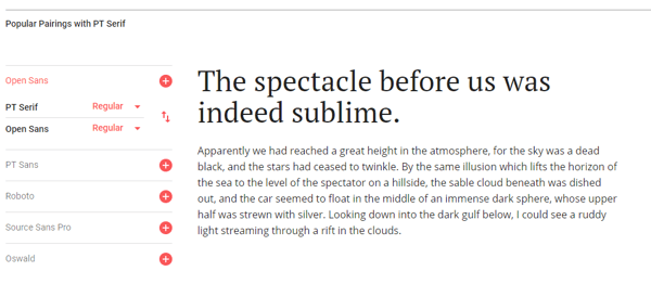
Head over to Google Fonts and enter text to see how each font looks. If you spot any you’d like to use in your resume template, add them to your PC or Mac. You’ll then be able to find them when editing your template in a document, like Microsoft Word.
Here are some recommendations for each font style:
When finalizing your font selection, avoid using a different font for each sentence. Stick to three or fewer throughout your entire resume template, or browse Google Fonts’ popular pairings for groups that are proven to work:
What Color Should You Use on a Resume?
Color is another resume design element that is totally decided by preference.
Here, best practice is a light background color paired with dark text.
Switching this around and using dark backgrounds can make text hard to read, and be too off-putting for the recruiter scrutinizing the detail in your resume.
But, in terms of best practice for any other elements, stick to three (or fewer) colors throughout the entire page. Going full speed ahead with 25 different colors could risk your resume template looking like a child’s coloring book.
CV vs. Resume: What’s the Difference?
CVs and resumes are two names for similar things. But, if you’re applying for a job, how do you know which document you should be sending — and the things you’ll need to include for each?
When to Use a CV
Send a CV (curriculum vitae) if the recruiter wants an in-depth dive into your experience. These documents tend to be 1-2 pages in length, and talk about various things in detail, including your education, experience, and skills.
CVs are used commonly in the U.K. but aren’t very customizable. That’s because achievements need to be listed sequentially.
When to Use a Resume
On the other hand, resumes are a one-page document that details everything a recruiter would need to know, without the added detail.
Since a supporting cover letter dives into the nitty gritty of your experience, a resume only covers top-level information. This makes them more to-the-point than a CV.
And, because the goal isn’t to explain your experience (it’s to make you stand out), they’re highly customizable. Feel free to let your creative juices flow and experiment with every aspect of your document!
5 Tips for Writing an Attention-Grabbing Resume
Did you know that recruiters only spend six seconds reviewing a resume? (That’s less than the precious seconds you spend making your morning coffee.)
You can stand out from the crowd of resumes on a recruiter’s pile by:
1. Include hard-hitting stats.
Grab the recruiter’s attention by using hard-hitting stats in your resume template, and relate them to your skills. Not only does this look more impressive, but it proves you do have the skills you’re listing — especially if you’ve got great results from them before.
These statistics can be used in your experience section. Take a look at the below example. Which looks more impressive to you?
- Redesigned the company’s website.
- Executed a complete redesign of the company’s website, which saw an uplift of 30% on-site conversions just two weeks after implementation.
Option B hits you hard and gives the wow factor, right?
2. Ditch the fluff.
A surefire way to make sure your resume gets tossed into the trash is to fill it with fluff. Remember, we only have a few seconds to win-over a recruiter with our resume.
The most common form of “fluff” on a resume template is overused skills that anyone is likely to have — such proficiency with Microsoft Word. That’s a skill most people learn in school, so it’s not going to set you apart from your competition.
It’s also important to remember that recruiters care for what you did that made an impact, not always what you coordinated or strategized. So, ditch the “managed a team of two people” and use “executed an entire rebrand for the company, directing a team of two to increase subscribers on the site by 50%” instead.
And, if you’re including non-relevant positions in the experience section of your resume outline, show how those skills translate to this job. That way, you’re proving you have cross-functional skills that relate to the role you’re applying for.
3. Make it fun.
Many job-seekers struggle to liven-up their resume without going overboard. The line can be fine between a sense of humor and immaturity in the workplace, after all.
However, you can liven-up your resume template (and demand your recruiter’s attention) by adding humor in the stories, facts, and information you share.
Boring resumes they’ve seen hundreds of times before aren’t going to make an impact. Creative resume templates that allow your personality to shine through, will.
4. Don’t overcomplicate it
A unique layout can make your resume stand out, but don’t go crazy (to the point where it’s too complicated to understand). Although it sounds obvious, it’s an easy mistake to make … especially when you’re experimenting with fonts, colors, and formats.
You can get a great understanding of how easy your resume is to read — without the risk of finding out from recruiters — by asking family and friends to review it.
Do they look overwhelmed when they first lay eyes on it? Are they asking questions like, “what does this mean?” or “where can I find your experience?”. If so, it’s probably too complex.
5. Use resume action words.
The words you’re using on a resume should be powerful. And, although any fluff should already be ditched by this point, a few simple tweaks to the start of your sentences could be all it needs to reach perfection.
You can do this by using action words, which give the wow factor to your resume template.
So, if you catch yourself writing “managed”, “was responsible for”, or “helped” to kick off a new sentence, replace it with “executed”, “trained”, or “directed”.
Free Resume Templates
Looking for a done-for-you template where you can cut and paste your own information? Luckily for you, we have a list of resume templates that’ll help you get noticed in a stack of others.
However, if you’d prefer resume samples that can be used directly from your document software, here are a few to keep your eye on:
Resume Templates for Word
Microsoft Word offers tons of templates to build your resume.
Simply open a new Word doc and type “resume” in the template search box:
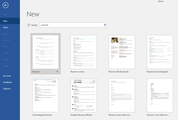
Our favorites include:
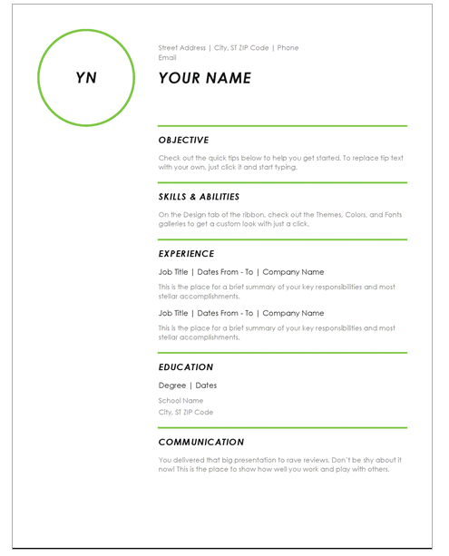
Resume (Modern Design)
This resume template is simple, but it covers everything you’ll need to include in your document.
Plus, with the option to add an image and the simple color choice, you can’t go far wrong:
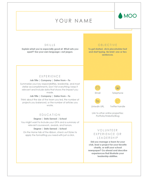
Crisp and Clean Resume
This template was professionally designed by Moo.com, and has a unique layout that’s easy to customize.
There’s also free matching cover letter template that you can use in conjunction with this resume template:
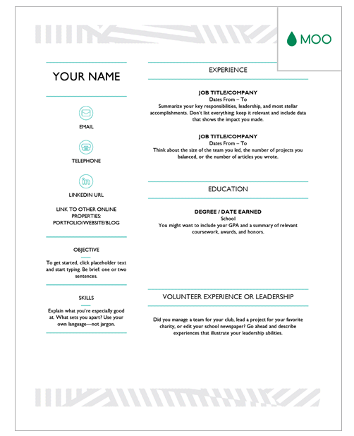
Creative Resume
Also designed by Moo.com, this Microsoft Word resume template uses fun patterns and icons to make your document stand out:
Google Docs Resume Templates
If Google Docs is your software of choice, you’re able to pick from five resume templates.
Once you’ve created a Google account (or signed into your own), head to Google Docs and hit “Template Gallery”.
Scroll down to see the Google Docs resume templates:
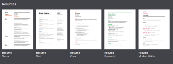
Our favorites are:
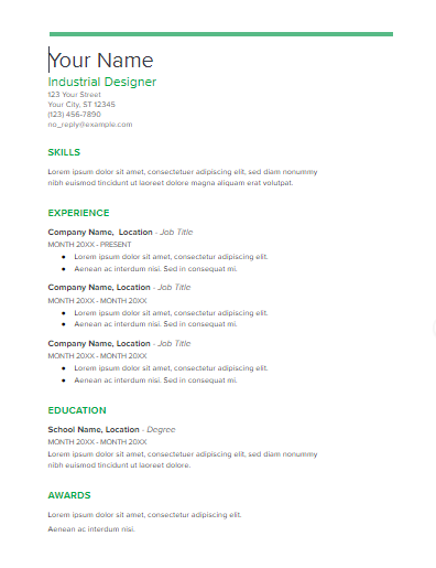
Spearmint
This one has got you covered if you’re looking for a modern, single-column resume template:
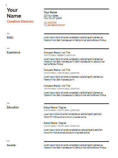
Swiss
This resume template for Google Docs uses a two-column format. It’s easy to read, but uses very little color:
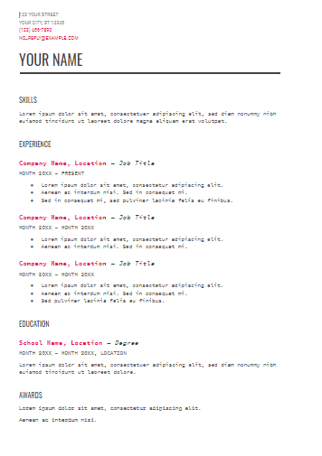
Modern Writer
Looking for a resume template you can use for writing roles? This Google Docs option uses a unique typewriter-style font that’s bound to set you apart:
Creative Resume Templates
Applying for a role where creativity is important? Graphic design, marketing, or branding industries might be looking for creative resumes that really go above and beyond to make an impact.
Luckily for you, you have complete control over every aspect of your resume template. You don’t always have to list your points in a boring black and white document. In fact, there are various other resume formats that allow you to show your creativity.
Our favorite? Infographic resumes.
Infographic resumes turn a boring one-page document into an exciting resume in image-form.
They’re fantastic for online applications because internet readers pay close attention to information in images. People spend more time looking at images than they do text when reading on the web, making it a simple way to make sure your resume doesn’t get lost in the sea of browser tabs that a recruiter has open.
However, infographic resumes come with a warning: Always check that online applications allow image uploads. Many sites only allow document files to be uploaded, so it could be a total waste of time if you create an infographic resume and can’t send it to the company!
Although they take longer to create and still need to be customized for each job you’re applying for, they’re a guaranteed way to make an impact and help your resume stand out.
Resume Builder Tools
The resume template tools we’ve listed here are bound to set you off on the right foot.
But, if you’re wishing to go above and beyond with your document, we recommend using these resume builder tools:
- Canva: Create your own infographic-style resumes using a professionally-designed template, or build your own from scratch. Then, download your infographic resume as PNG, JPEG, or as a PDF.
- Resume Genius: Choose from 20+ resume templates and get your final version personally reviewed by a resume expert. It’s great for people who’re too shy to ask family and friends for feedback!
- Visual CV: Go against the norm and create an online resume instead of a document or image-based one. Once built, you can add a link to your online resume from your personal website.
- Resume Coach: This site offers lots of pre-made resume templates to choose from, varying in format, color, and style. Plus, they’re exclusive to this site — you won’t find the same ones on another site. There’s no need to worry about selecting a common, overused template.
Conclusion
Great job. You’ve just created a resume template that’s bound to land your dream job!
When adding details to this document, remember to be unique and look into the application requirements for each one.
You’ll soon stand out from the crowd, be invited to interview, and maybe even land your dream job.
No comments:
Post a Comment